Words by Marion Bisserier
English version | Lire la version française →
Issue N.19
Oct. 2020
Author : Marion Bisserier
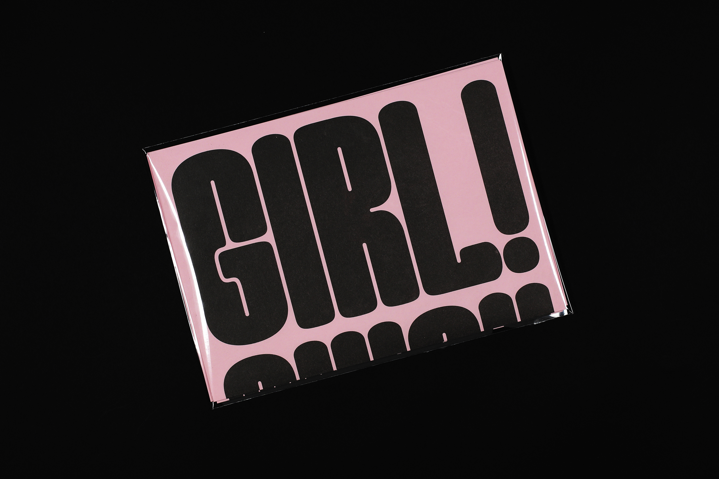
Font: Good Girl
Printed in the margins of:
Cassochrome, Waregem [BE]
± 1000 copies
Marion Bisserier proposes an ironic reaction to the underrepresentation of women in the typographic industry by saturating space with the Good Girl font.
Beyond operating as a vehicle for language, type design finds its power in conveying meaning visually, through the use of form and rhythm. Although passionate about typefaces, I somehow lacked the confidence to design my own. While studying graphic design at London College of Communication, the references I was exposed to were predominantly drawn from the Swiss style and modernist movements of the fifties. Intimidated by the tyranny of rational and systematic thinking, I was for a while convinced that type design would not be my strong suit.
Throughout my path in the industry, as I became familiar with new typographic influences, I soon realised that type design contained in fact not one but rather an array of practices, with varying degrees of restriction and freedom. One thing however which still jumped out to me was the underrepresentation of women within the field. During my research, I came across Suzanne Deschamp’s essay in Women In Graphic Design 1890-2012 (Breuer, G. et Meer, J.), in which she explains how women on average only make up 14% of the designers at typographic conferences even though their numbers are equal to men’s in education [1]. I was so intrigued by this gap to the point where it became the ideal topic for me to design my first ever typeface.

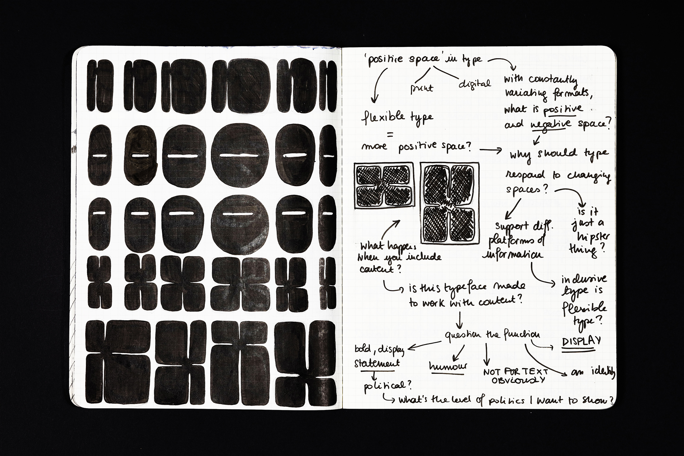
I was much more interested in how we as women could reappropriate ourselves some space, physically and politically within our field.
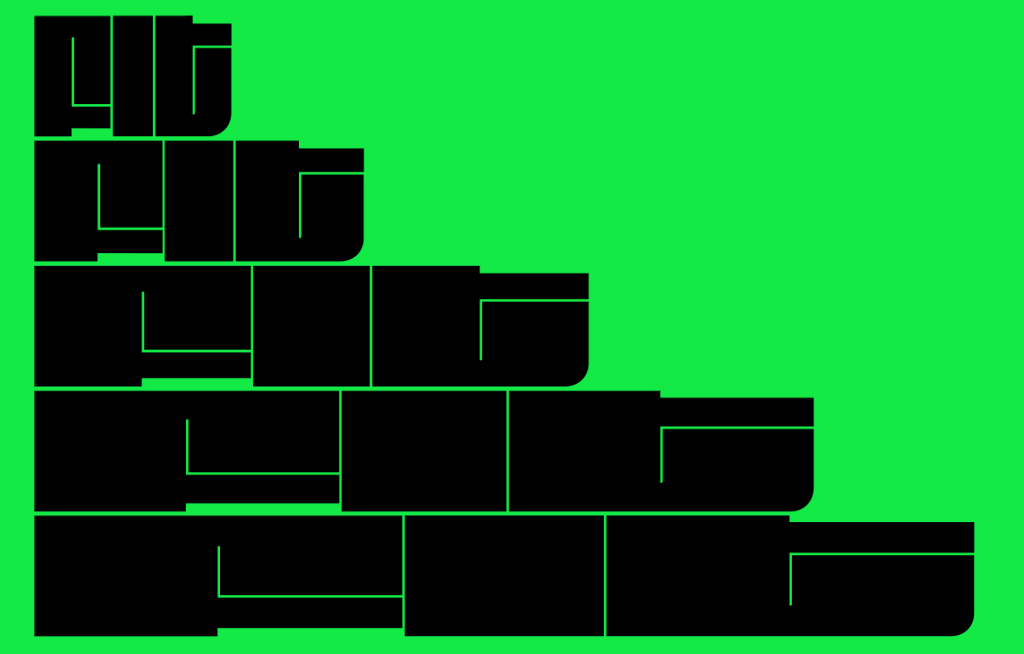
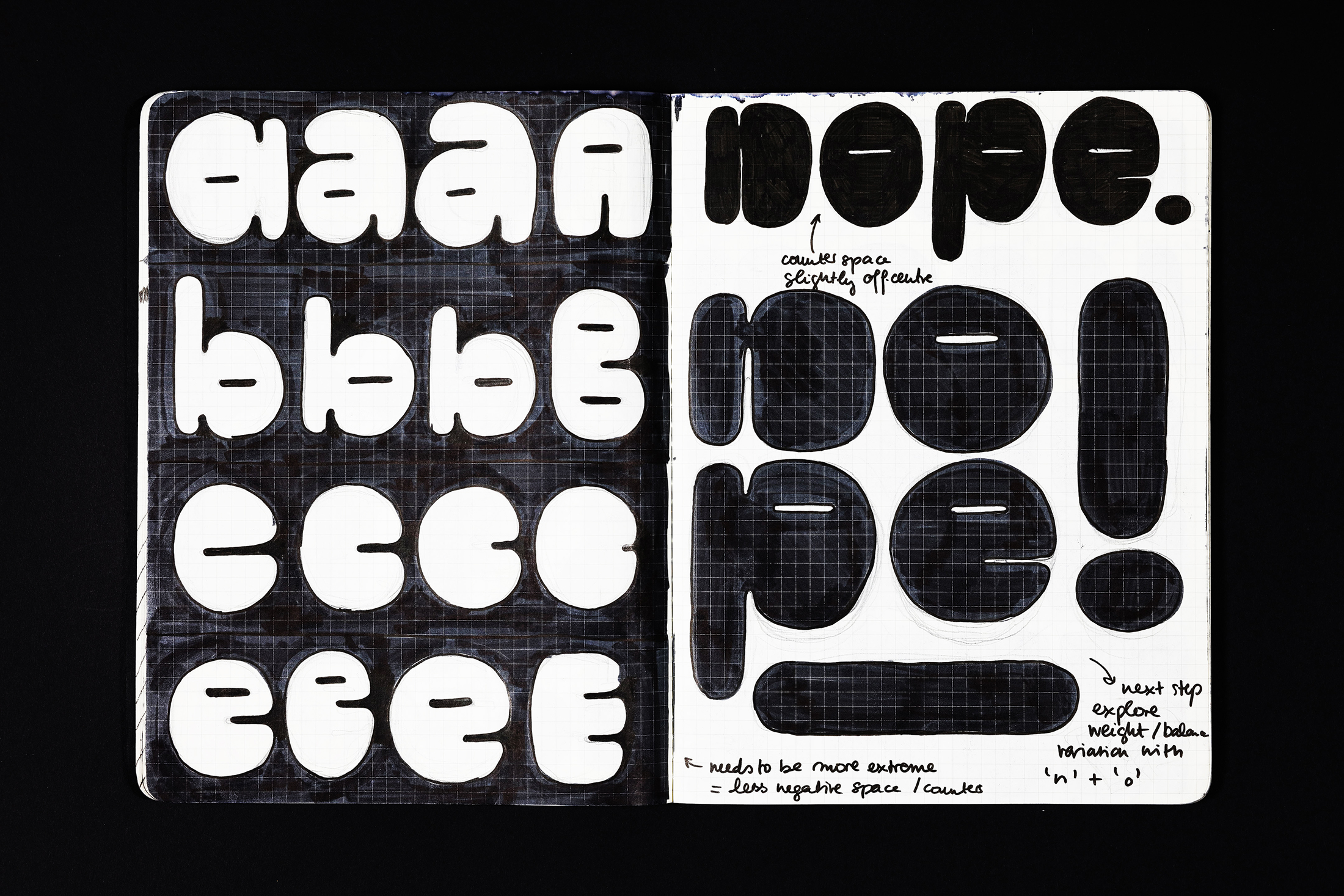
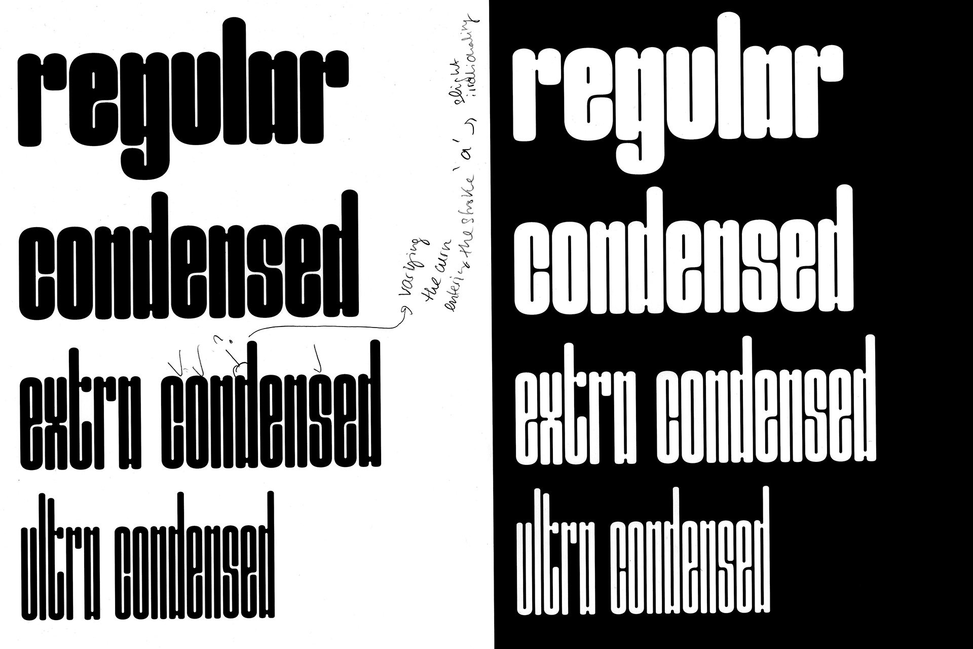
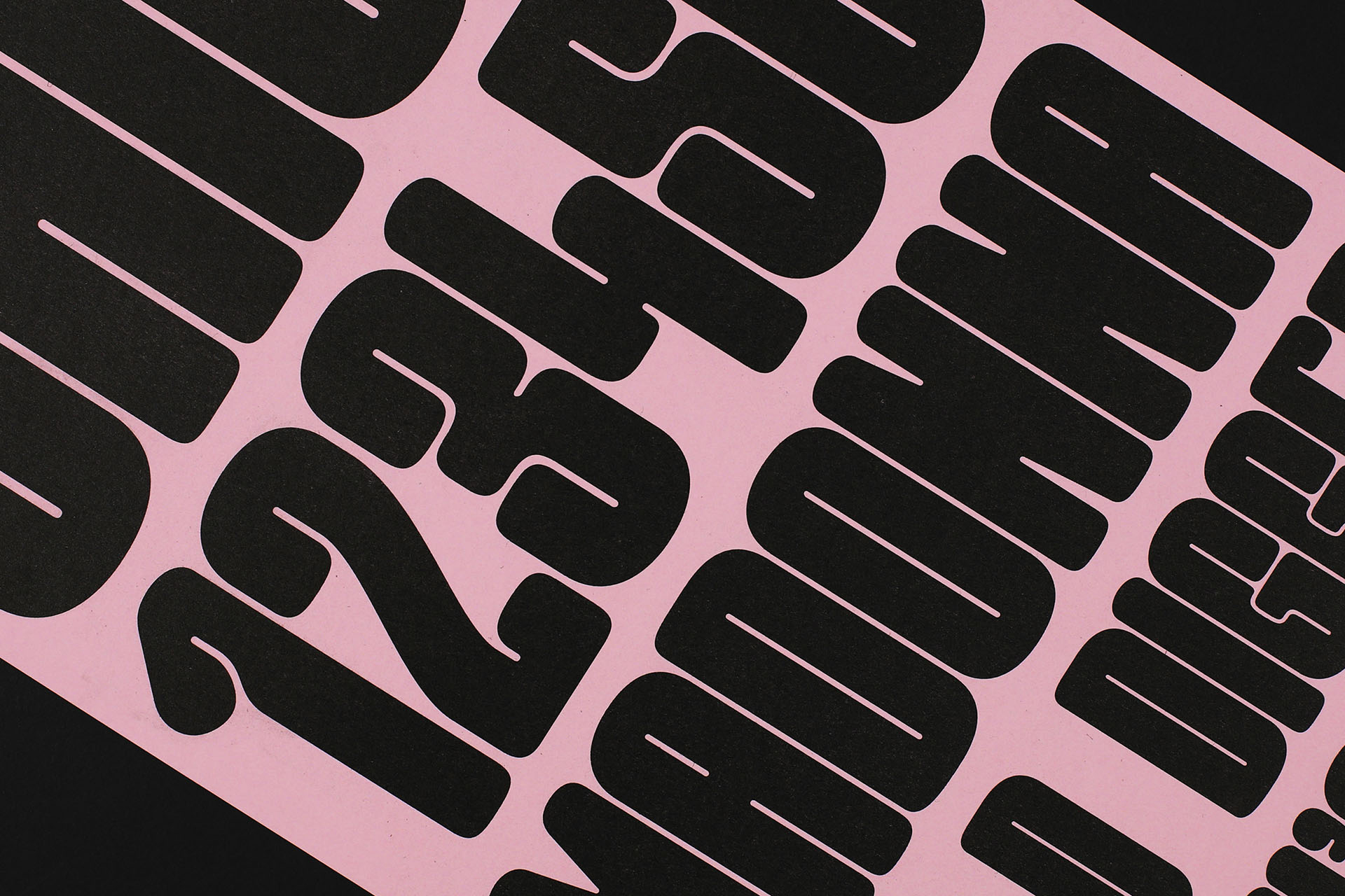
From my initial sketches, I was very careful about avoiding the caricature of what a feminine typeface should look like. Rather than trying to convey expressions of a presupposed delicacy or a certain form of femininity, I was much more interested in how we as women could reappropriate ourselves some space, physically and politically within our field. As I carried out my experiments, I came to the realisation that drastically reducing the counter-shapes of a letter would create this sense of visual saturation on the page. This observation stimulated me to pursue the design of my unreasonably bold font.
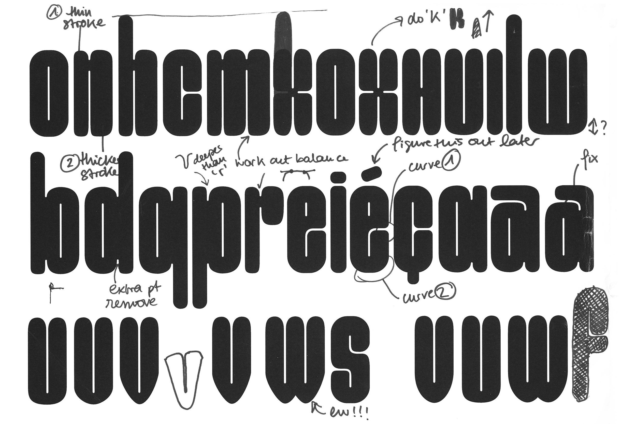
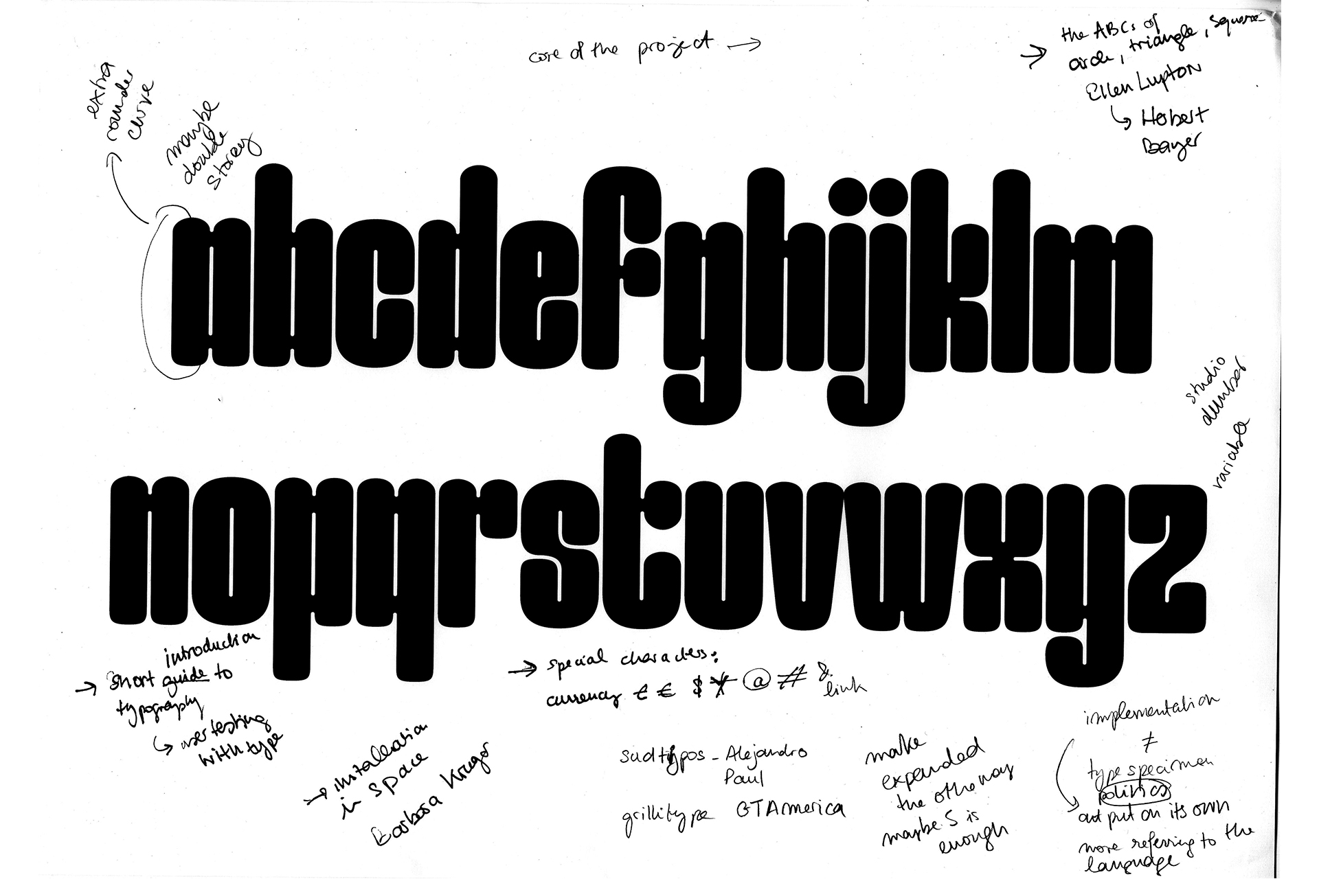
This occupation of space coupled with the “roundedness” of the characters also intentionally reflected the tongue-in-cheek with which I felt I could tackle sexism more successfully in this project. With the precious advice of the typographers Toshi Omagari and Nadine Chahine (Monotype) as well as the help of my tutor Paul McNeil, I was able to balance out these wacky traits and maintain a consistent system throughout the entire glyph set. One could say that I finally came to terms with the rational and systematic approach of the Swiss style which proved itself not so useless after all!
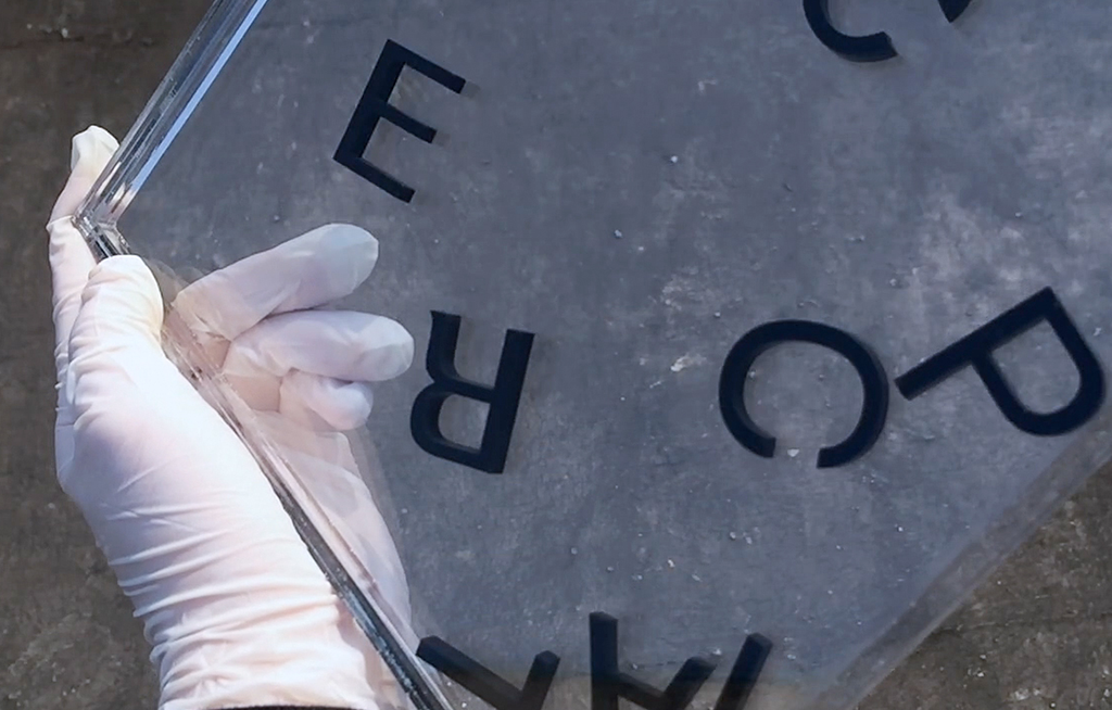
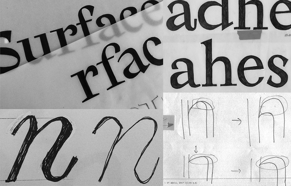
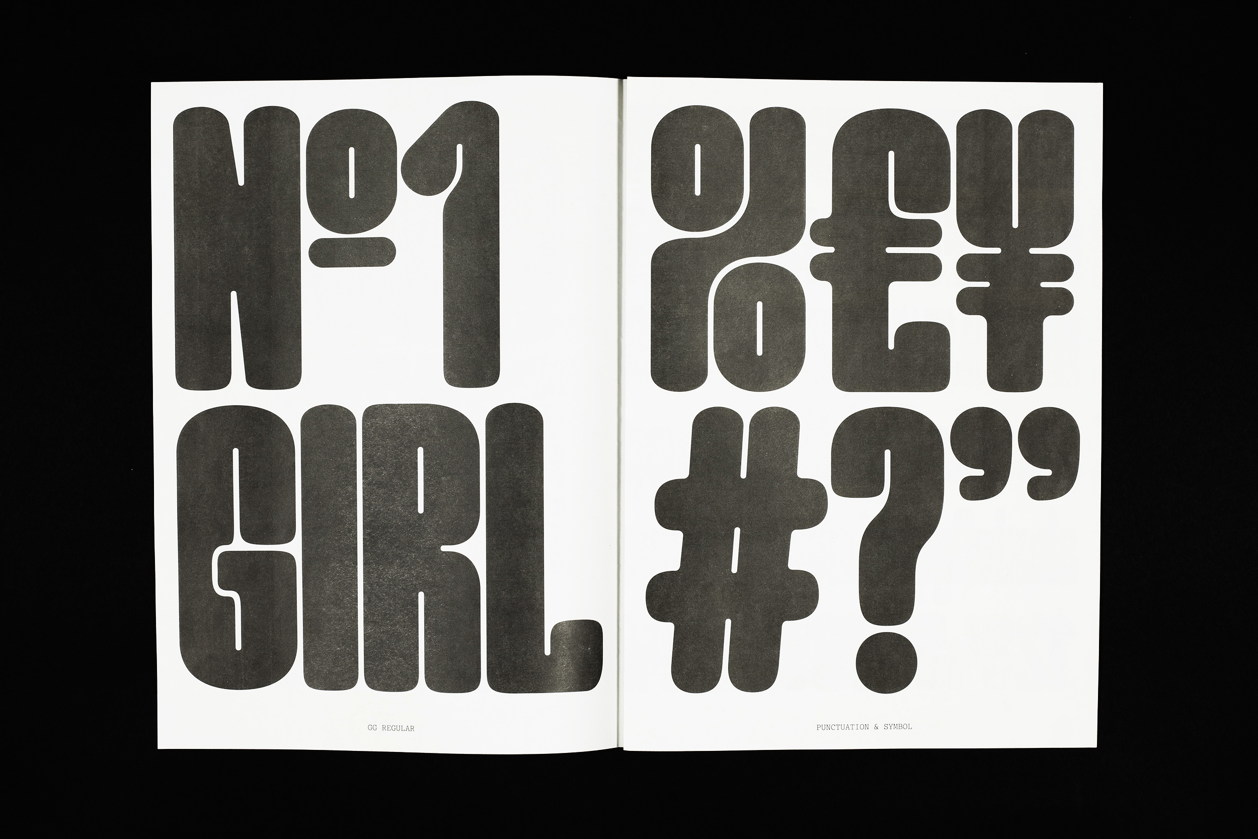
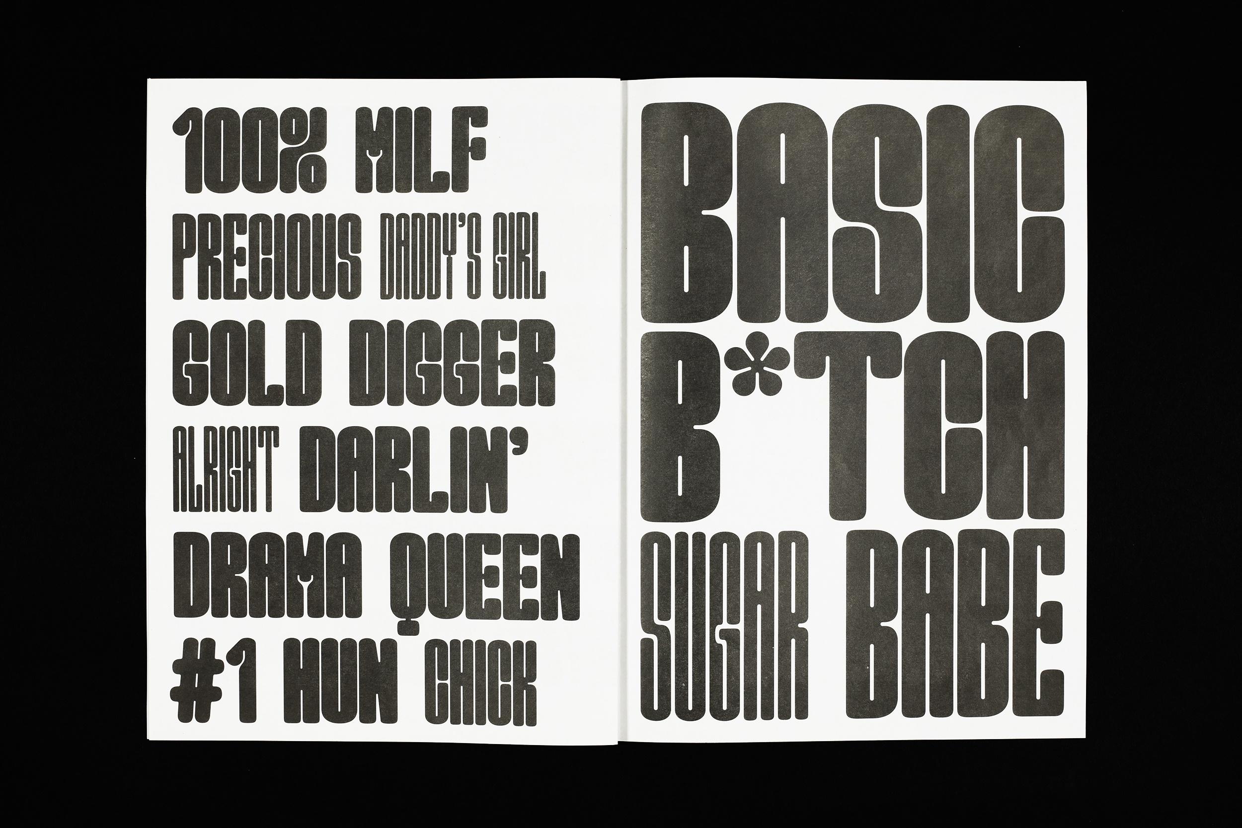
Moving on to the design of the type specimen, it felt necessary to retrace my project back to its rooted concept: challenging the status quo of women in typography. Ironically, typefaces articulate themselves through a mechanism of stereotypes. For instance, the shape of a lower case “r” will dictate the form of the letters “u”, “n”, “m” and “h” and therefore builds our expectations of how each character should look [2]. By reappropriating myself a vocabulary that is traditionally used to degrade women (like “precious”, “daddys girl”, “darling”, “gold digger”…) and injecting it back into my specimen, I flip its stigmatising meaning on its head as a way of approaching it critically. Little by little, this ironic play on stereotypes became the connecting thread running through my project (and this issue of La Perruque) which led to naming the typeface Good Girl.
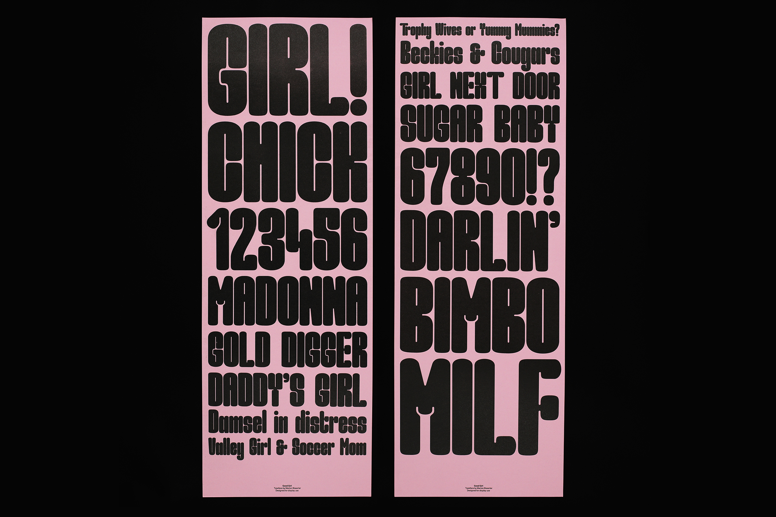
Good Girl
Available for purchase on request, please contact Marion Bisserier.
Marion Bisserier is a London based designer who recently graduated from BA (Hons) Graphic and Media Design at the London College of Communication. She has a passion for typography and its potential to visually convey meaning beyond the language it primarily serves.
Links:
marionbisserier@hotmail.com • marionbisserier.com • Instagram