Words by Weiyi Li
Translated from Mandarin to English by Weiyi Li
English version | Lire la version française →
Issue N.16
Nov. 2019
Author: Weiyi Li
Font: Helvetica on the earth
Printed in the margins of:
Cassochrome, Waregem [BE]
± 2000 copies
Graphic designers use various concrete terms to describe typesetting, like weight and density. Designers of Chinese characters even emphasize the “center of gravity” of a character. Weiyi Li decided to use this rhetoric in connection to the iconic Helvetica.
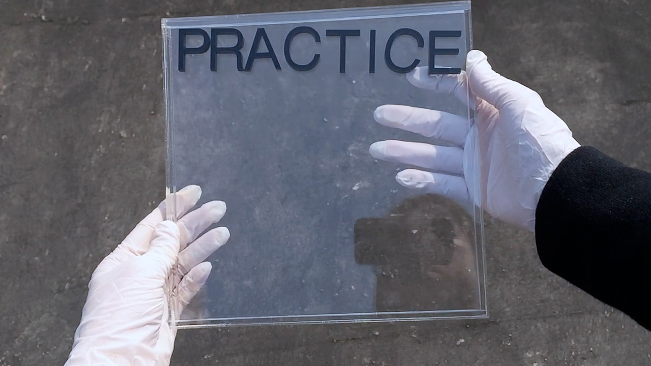
In 2015, two friends invited me to design a logo for an art space called PRACTICE they were running. PRACTICE is located in the Lower East Side of New York. Even if you haven't been there, you should imagine it surrounded by many Chinese restaurants and galleries. At the end of that September, I received an email from Cici, one of the founders of PRACTICE:
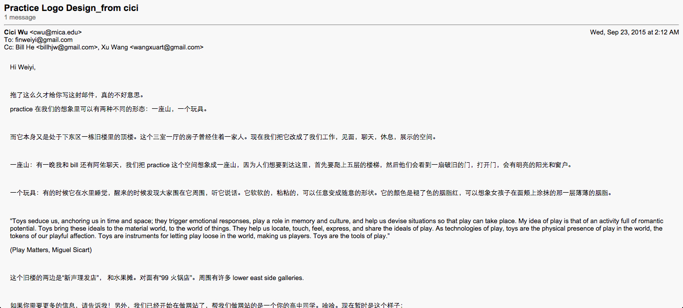
In her email, she defines the space using two things: mountains and toys. When Cici mentions mountains, what she describes is not a huge geological body but a rising or falling trend. When she mentions toys, she describes them as a material representation of the act of playing.
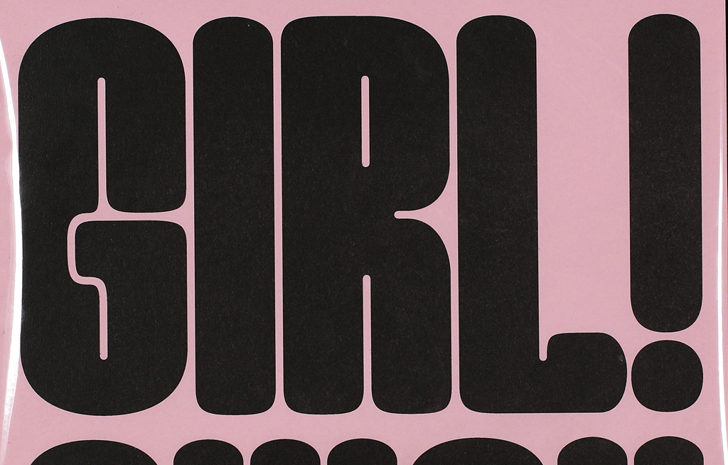
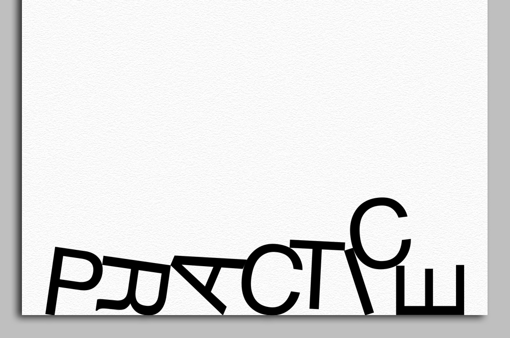
While trying to find a direction between these two metaphors, I wanted to try something for this commission that I'd been curious about for a long time. Graphic designers have long used various concrete terms to describe typesetting. They use weight to describe fonts, and density to describe the structure of paragraphs. Designers of Chinese characters even emphasize the “center of gravity” of a single character. But what if we really face up to the physical nature of words and languages? What if the text really has thickness or weight? How will they be affected by gravity? If they were put in water, would buoyancy create their own “format”? If I let go of the format of the words completely, how will they strike a balance while losing control due to their physical properties? In what visual state will they be? So I made this small “toy” and played with it for a while:
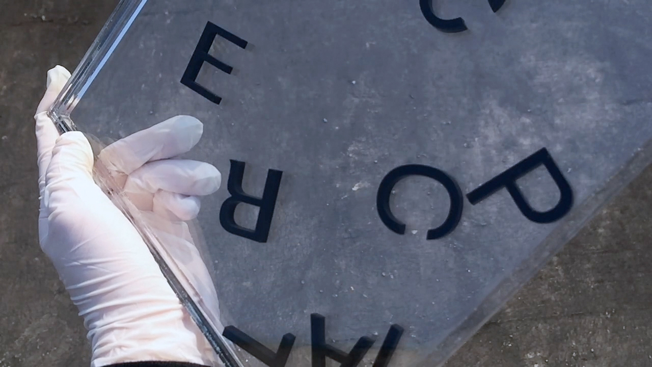
And this “toy”, if placed in space, can be an object that everyone can play with.
The standard format of this logo is always on the edge of its medium, whether that is a paper one or the browser. This is the first time I have used Helvetica in years. I needed a font that was boring to the extreme, a font that everybody knew.
This Logo can be seen as a reflection of the surroundings, if you have seen the worn-out or incomplete signboards of Chinese restaurants in the Lower East Side; it is also a mountain, an unstable movement of ascent and descent, accumulation and scattering; a toy, making all those who touch it a part of the game; a PRACTICE, an exercise between control and out of control.
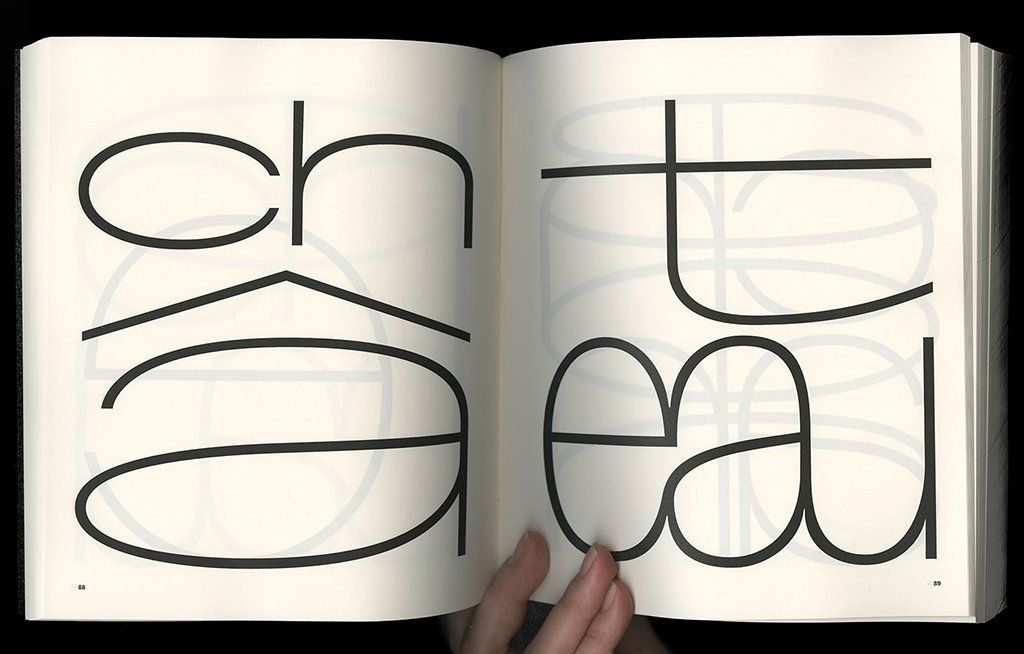
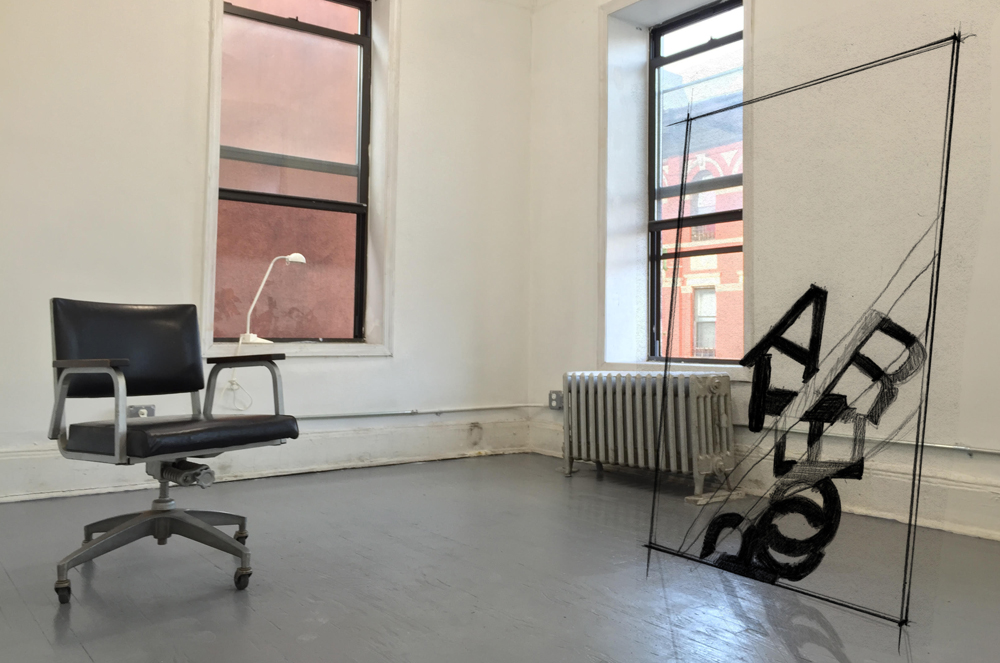
Two years later, the two owners of the space invited all their friends to participate to an exhibition. I decided to continue the idea and draw a whole set of Helvetica font under the influence of gravity, which would then be used in the text appearing in this exhibition. I used a two-dimensional gravity simulator to test how each character in Helvetica would fall from the sky, and make the final character shape into font.
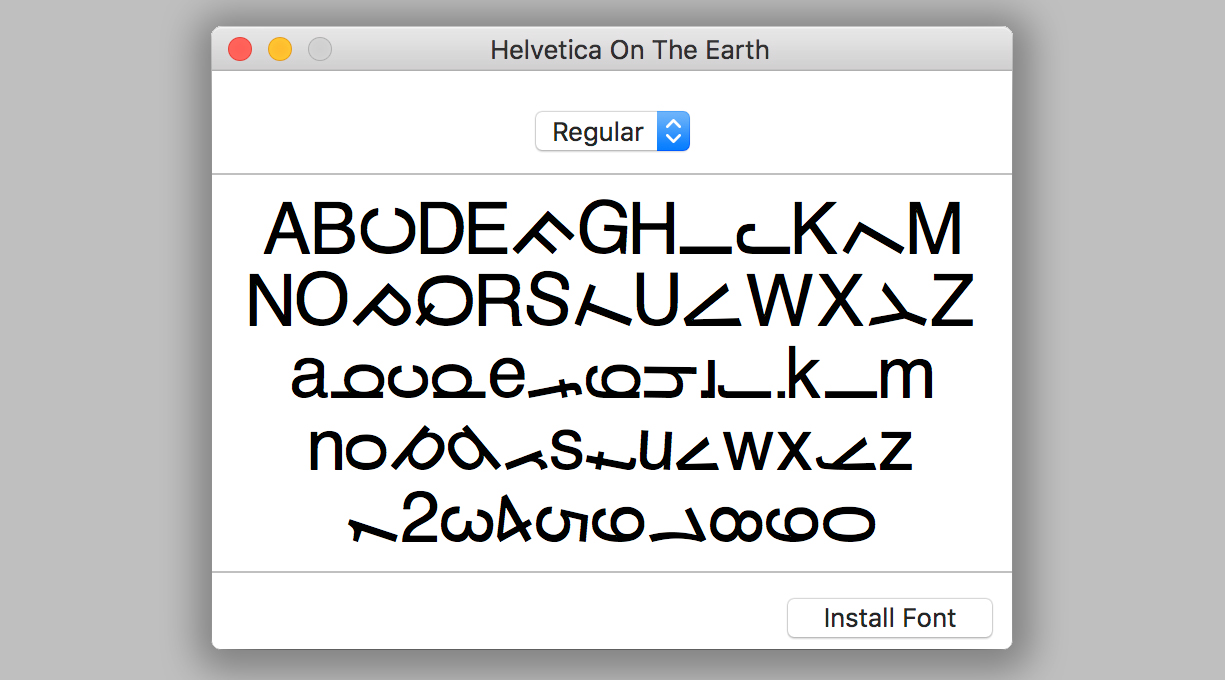
The partner who worked with me was still gravity. This power breaks our knees, smashes our cell phone screens, and pulls down our cheeks and breasts. It was once seen as a problem. People built tables and chairs so they no longer sit on the floor, or built skyscrapers to seek more space in the vertical direction. Today, in all fields, gravity seems to be back to us.
For example, classical ballet dancers have been trying to get rid of gravity, but in the field of modern dance, there are a lot of floor movements towed by gravity. If computer code also has physical properties, the direction of gravity in the former html world is exactly at the opposite of the real world. The gravity direction of html is upward to the left, that is to say, if you use code to place text or pictures on a web page, they will all be attracted by the invisible gravity in the upper left corner of the browser. But now there is also javascript code that simulates gravity. It's like the time has come, fruit ripening and falling, gravity becoming our partner again.
Helvetica On The Earth
Please contact Weiyi Li to get more infos about how to use Helvetica on the earth.
Weiyi Li is an artist weiyi.li, designer weiyiandfriends.com, curator bigbadgallery.com, publisher re-publication.com and retailor currently-available.com who lives and works between these URLs.
Links:
finweiyi@gmail.com