Words by David Jonathan Ross
English version | Lire la version française →
Issue N.17
Nov. 2019
Author: David Jonathan Ross
Font: Fit
Printed in the margins of:
Cassochrome, Waregem [BE]
± 2000 copies
When he designed Fit in 2017, David Jonathan Ross was one of the first to make use of variable fonts technology. With this typeface – a manifesto? – he blatantly demonstrates the infinite possibilities of variations that are now available to designers composing text. Two years later, the demonstration still seems as effective and relevant, although the technology is still often used for its spectacular effects in projects released ever since.
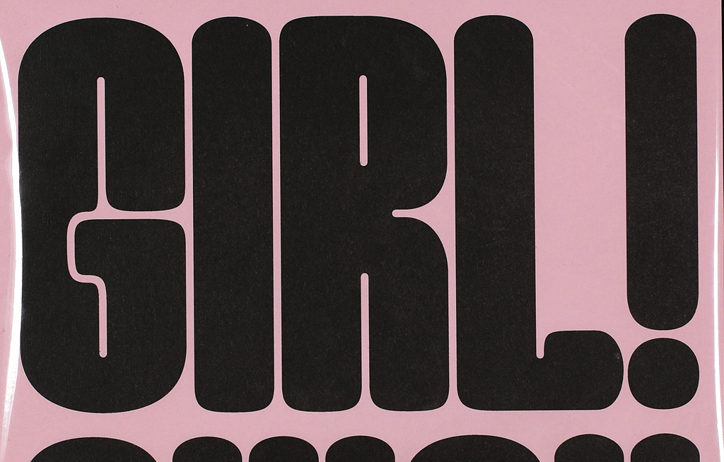
My typeface Fit is designed to squeeze and stretch to occupy a vast array of proportions, from extremely narrow to extremely wide. So it seemed like a natural fit for La Perruque, whose format is simultaneously extremely narrow and extremely wide.

Released in January 2017, Fit was an early Variable Font, and in my mind the entire premise of the typeface could not exist without the technology. I wanted the typeface to be a blunt example of what it means to give designers direct access to thousands of finely-gradated variations within a designspace.

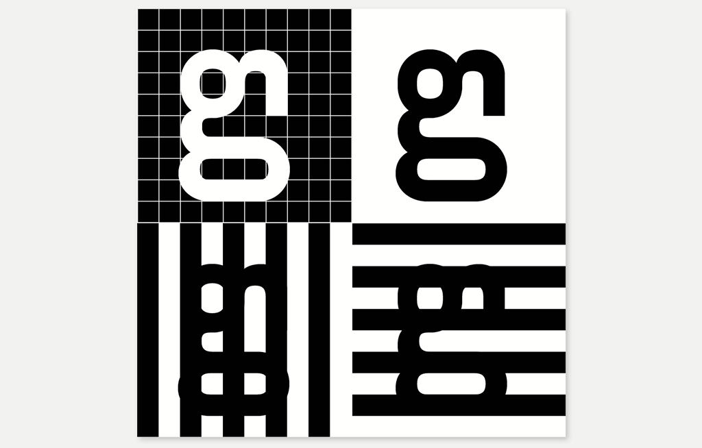
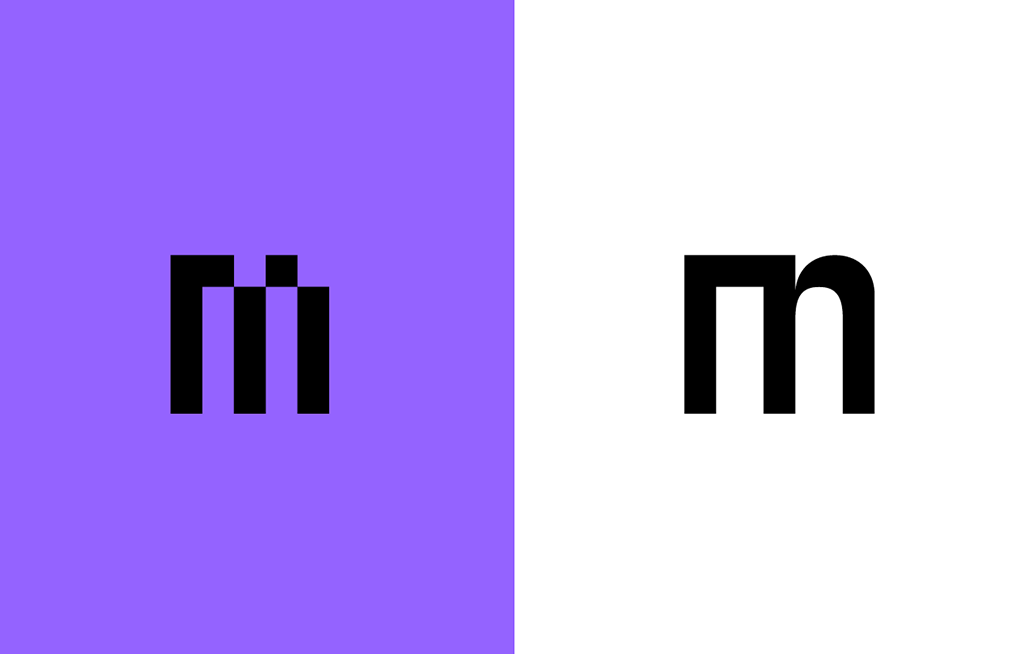
I had some fun sketching my designs for La Perruque using Drawbot, a Python-based 2D drawing tool. This allowed me to quickly experiment with ideas like using a different width for each letter in the specimen. In the end, the widths reflect the content. My final implementation focused on a handful of instances that represented Fit’s range.
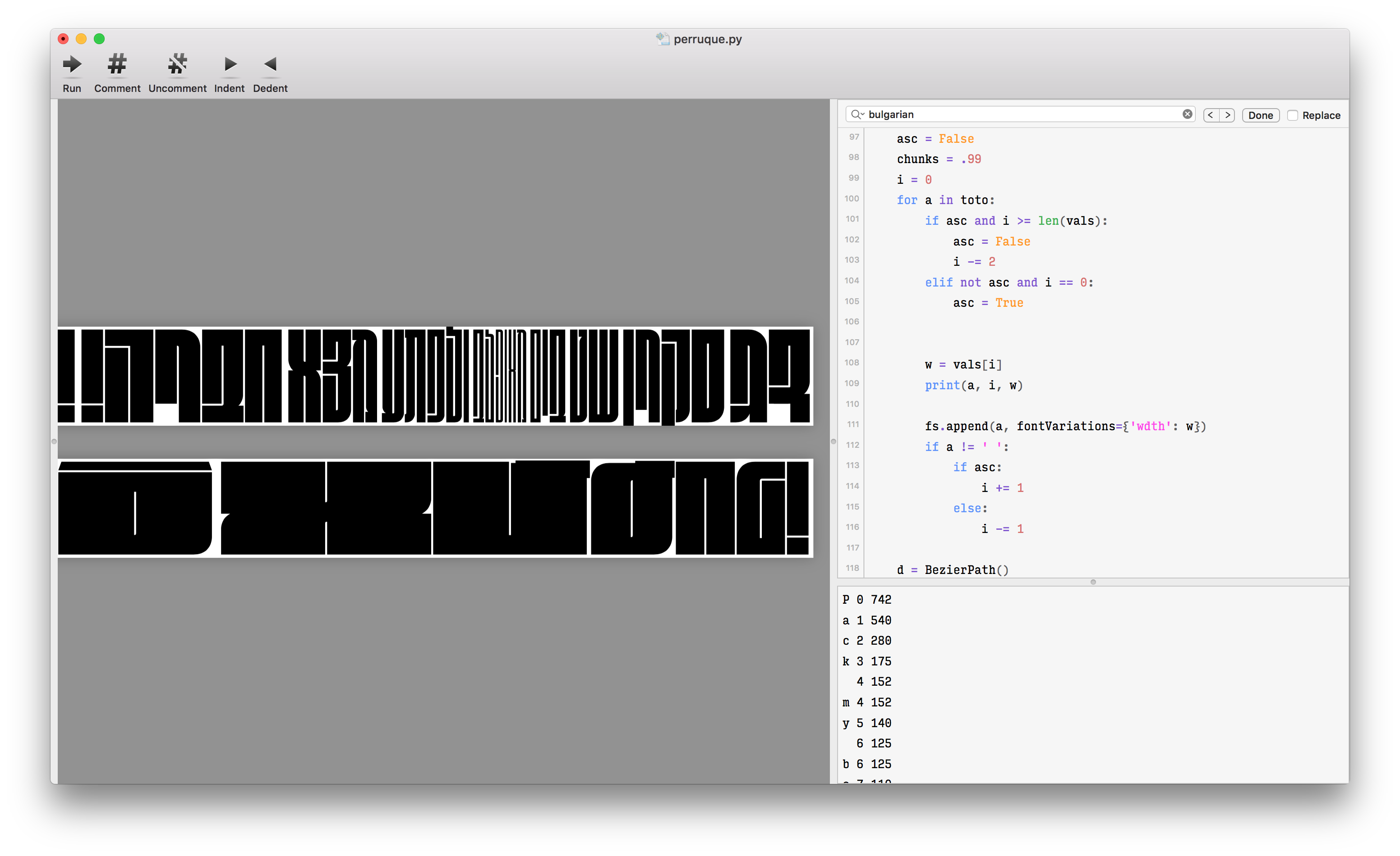
While the recto features Fit’s range and variability, the verso focuses on Fit’s counterforms. Floating in a sea of black, Fit’s counterforms are the true stars of the show, anchoring the typeface together and remaining consistent across all of its variations. These negative shapes cut dramatically through the letters, fusing them into a mesmerizing network of black and white (or purple and white, as the case may be).
Fit DJR (End User License Agreement)
Available for purchase at djr.com.
David Jonathan Ross draws letters of all shapes and sizes for custom and retail typeface designs. A native of Los Angeles, He began drawing typefaces at Hampshire College and joined The Font Bureau in 2007 where he honed his bézier-wrangling skills. Now he publishes his typeface designs at his own foundry, DJR, as well as working on projects with Type Network and developing unusual display faces for his Font of the Month Club. You'll find him in the woods of Western Massachusetts with his partner Emily and their two dogs, Sophie and Lily.
Links:
david@djr.com • djr.com • fontofthemonth.club • Retro Script L.A. • Backasswards • Python-based tools