Words by Fátima Lázaro
English version | Lire la version française →
Issue N.25
Dec. 2021
Author: Fátima Lázaro
Typeface: Cardone
Printed in the margins of:
Graphius, Brussels [BE]
± 200 copies
With Cardone, Fátima Lázaro reverses the function of the character specimen to share part of the bibliography published by alphabettes.org. This bibliography—proposed by Elena Veguillas and completed by members of Alphabettes—takes stock of the position of women in the typographical field.
Talk (video)
Scotch Romans
Fátima Lázaro
21.04.2022, erg, Bruxelles
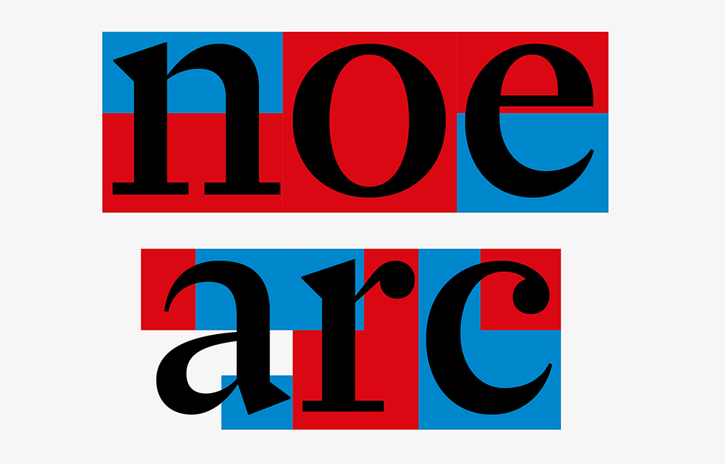
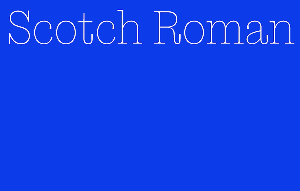
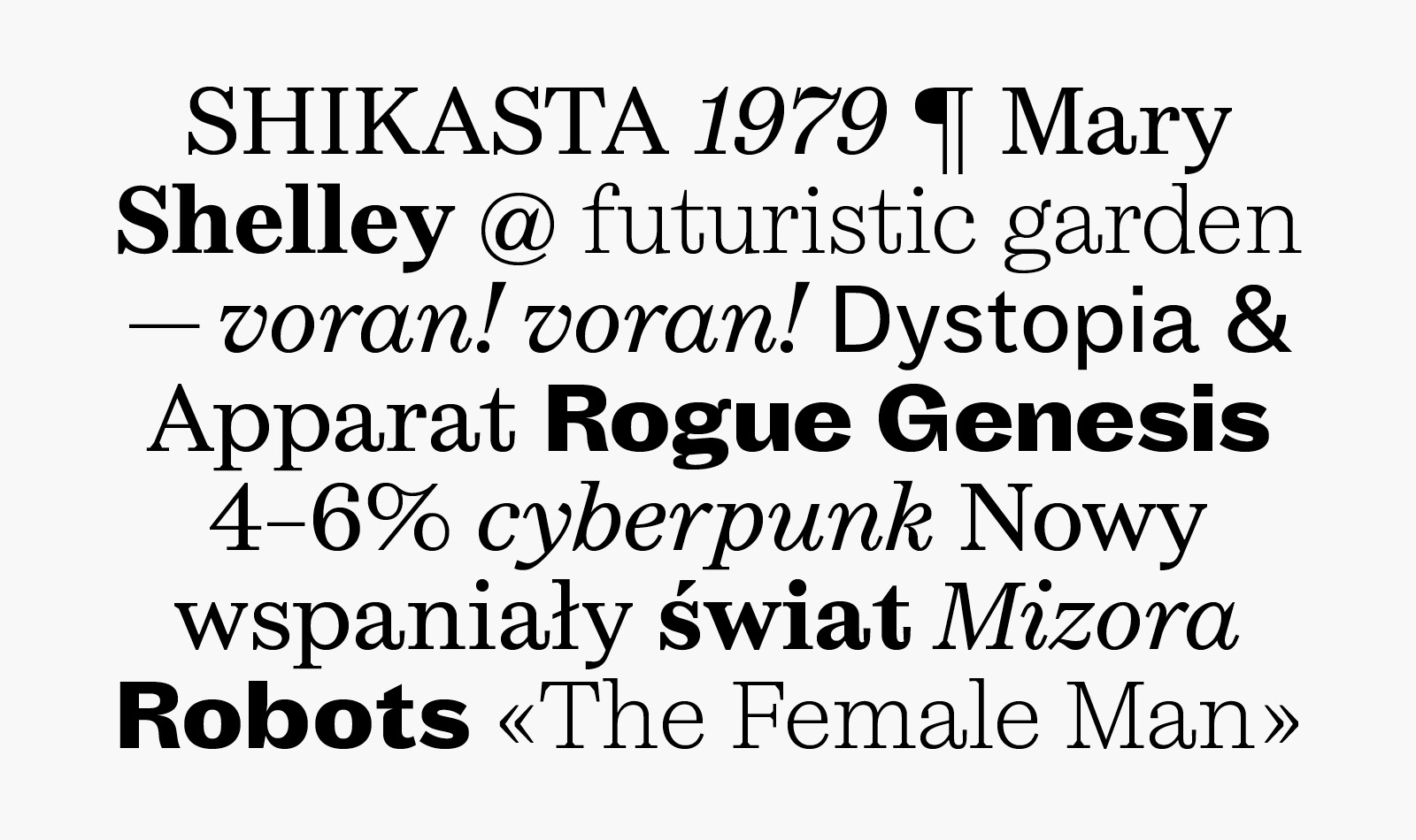
Cardone is a font family inspired by an early Scottish modern typeface: a pattern later renamed Scotch Roman. Its style is hard to categorize. It features crisp and rigorous shapes like those in the Didots family, but also smoother contrast transition and asymmetric angles in the serifs. The evolution of this typographic palette is particularly stimulating to me.
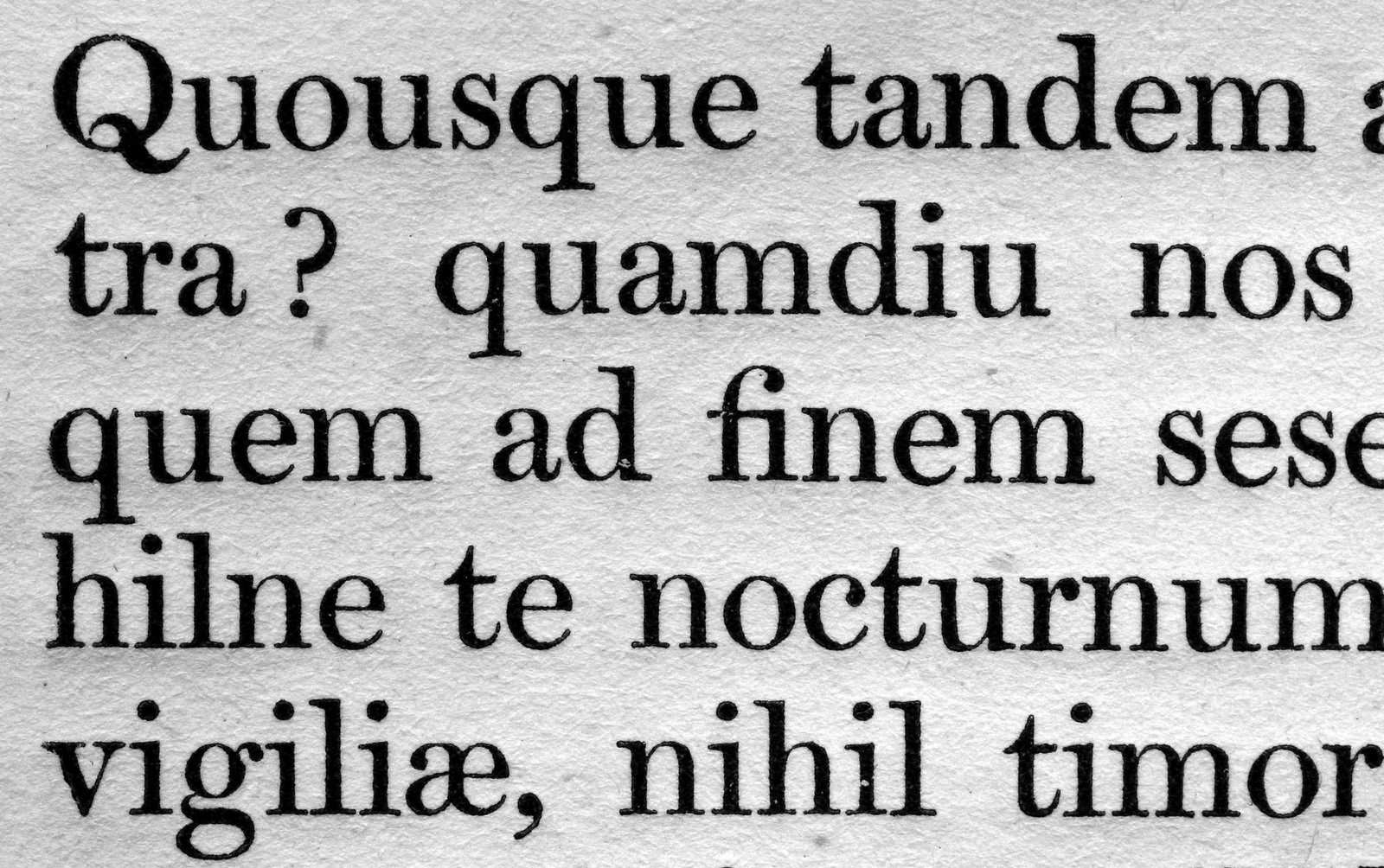
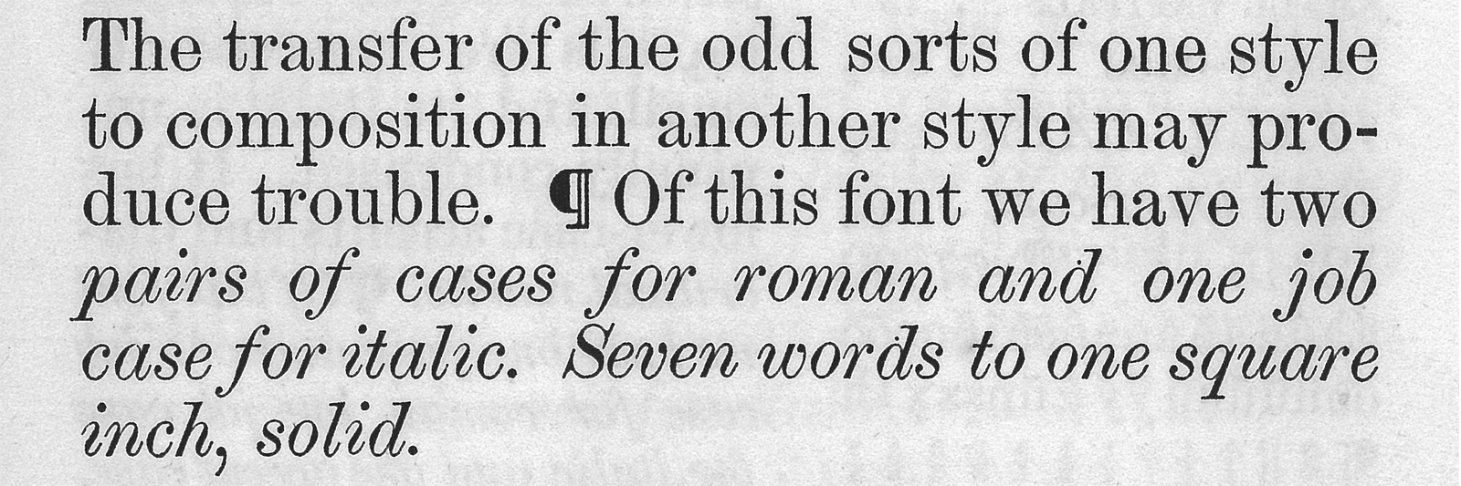
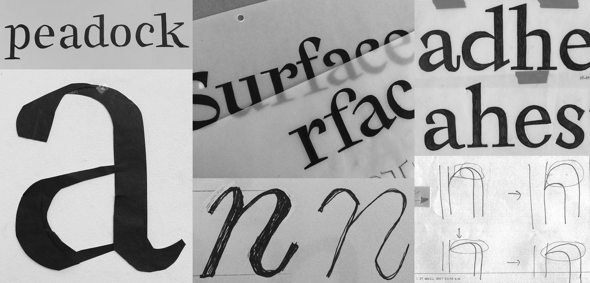
Cardone is not a revival. This family explores in its own way the right balance between elegance and robustness specific to Scotch Romans. Its design combines pronounced curves with abrupt lines built on a vertical axis. To compensate for the sharpness, its attacks and endings are simple and smooth. Cardone has been designed to be functional and readable in plain text, but it also adapts to intermediate composition sizes thanks to its significant contrast.
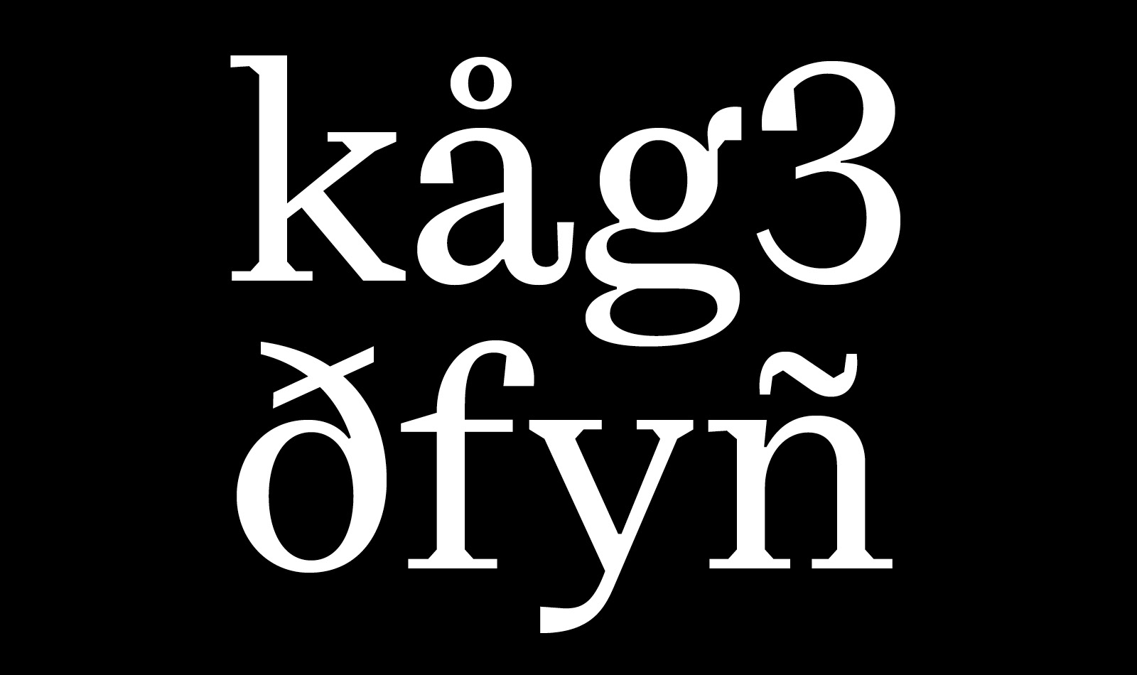
Cardone Regular.
The italic was designed to convey a stronger personality, liveliness and tension. Cardone italic comes close to the contrast of the English relief and the line of the pointed pen, a construction that is historically found in the italics of the Scotch Roman style. Despite the delicacy of its thin lines, certain details of the ialic reference the raw and rational forms of the Roman. These two stylistic choices, opposed a priori, create a form of dynamism which gives the text a warmer tone.
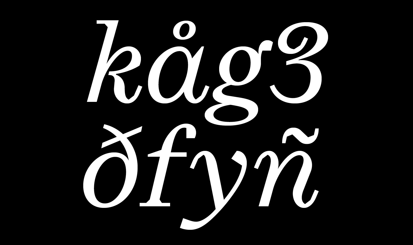
Cardone Italique.
Cardone is part of a certain tradition due to its particular historical references, which have been appropriated, challenged, and finally overcome. The search for a contemporary aesthetic, combined with the desire to meet the constraints of legibility, required reaching a fairly complex and very instructive balance.
“The relation between shape and countershape, which in writing amounts to the relation between white and black, is the foundation of perception. The interpretation of every sensation from any sense organ works on this principle.”
Gerrit Noordzij, The stroke: Theory of writing, Hyphen Press, London, 2005, p. 15.
Following the words of Gerrit Noordzij, this essential notion of contrast guided me through the process of experimentation around my typeface until its final form.
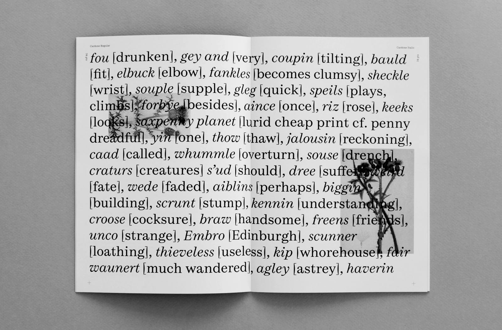
In this issue of La Perruque, I have chosen to reverse the function of the specimen by highlighting a series of bibliographic sources. These stand as clues for a research process, that is, the origin of my creations.
By transposing part of the bibliography published on the alphabettes.org, website, this issue transgresses the main function of the typeface to become a space devoted solely to the question of women in typography. This compilation proposed by Elena Veguillas, and completed by other members of the Alphabettes collective, is intended as an entry point for all those who wish to understand the current situation of women in the typographic field, a topic that is both fundamental and fascinating.
The Cardone project continues its exploration around the notion of contrast. The multi-style family is under development, the ultimate goal of which is to meet contemporary needs and provide an effective tool for designers and publishers.
This project started in the context of the post-diploma “Typography & Language” (EsadType), presented in February 2018.
• EsadType, Cardone
• Elena Veguillas, Women in type bibliography, alphabettes.org
Cardone
Available for purchase at 205.tf.
Fátima Lázaro is a Mexican typeface and graphic designer, currently based between Paris and Lyon, France. In 2018 she graduated from the postgraduate program Typographie & Langage (EsadType) in Amiens, France. Since then, she has collaborated with inspiring designers such as Alice Savoie, Roxane Gataud or 205TF. She creates typefaces, including bespoke designs and type development, lettering, and printed matters for commissioned work, in parallel she develops her own type related projects. She also is a contributor to the creative cycling project NVAYRK as an independent art director since its foundation in 2015.
Links:
fatimalazaro.com • Instagram