Words by Hélène Marian
English version | Lire la version française →
Issue N.28
Oct. 2025
Author: Hélène Marian
Typeface: PVC/Lettering
Printed in the margins of:
Cultura, Wetteren [BE]
± 400 copies
In this specimen, Hélène Marian puts her type design and sign painting practices back to back. On the recto, a noise solo typeset in PVC, an off-standard typeface made up of nothing but black sheep. On the verso is a reduction of large banners painted with the names of the music labels exhibiting at “12h24-24h12”, unclassified music fair at Instants Chavirés in 2023.
Her article untangles the links between these two approaches, which try not to caricature each other, but to engage in dialogue, feeding off each other without lying about their nature or the possibilities they offer.
90 cm-long noise solo typeset in PVC Banner, Dynasty, Express and Menu.
Between 2018 and 2023, the various members of the protean PVC type family were released. Far from being a “typical” family, PVC is made up of nothing but black sheep: each new member embodies in its own way an idea of the transition from hand lettering to a digitized system, shedding a greater or lesser degree of gestures in favor of a wider potential for use.
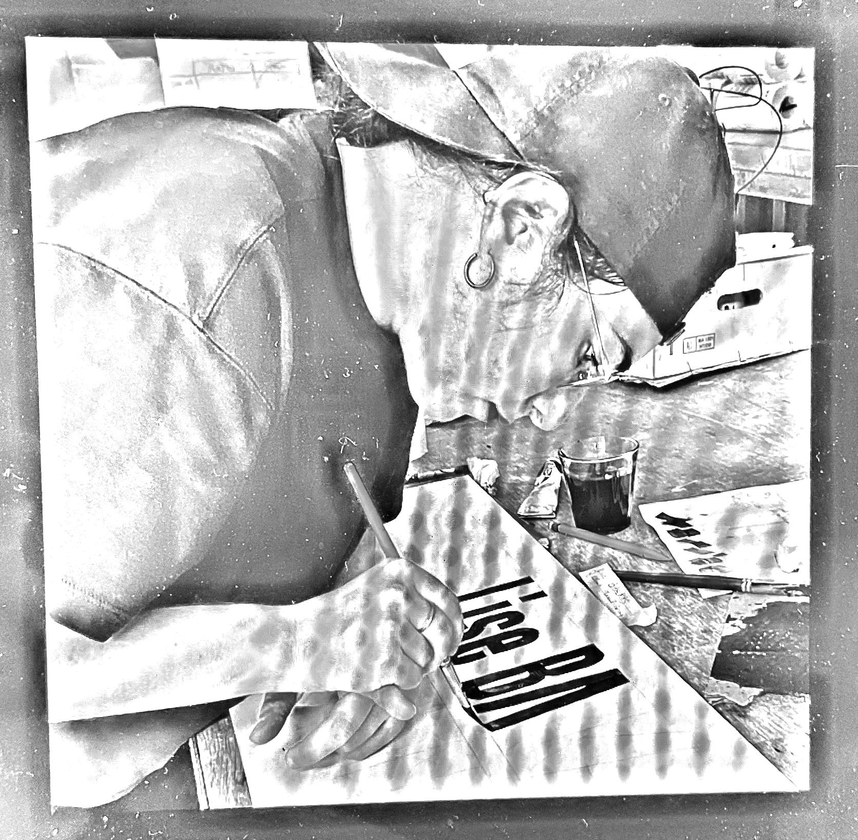
Before being a typeface, PVC was born out of my daily practice of hand lettering. Like musicians practicing their scales, I trace hundreds of letters over the years to compose the covers for the untimely releases of the experimental music label No Lagos, as well as for venues and magazines devoted to this same music scene. These accumulated letterings become so many typographic possibilities. Do 10 almost-similar but different “a's” hold the key to a single, typographic “a”?
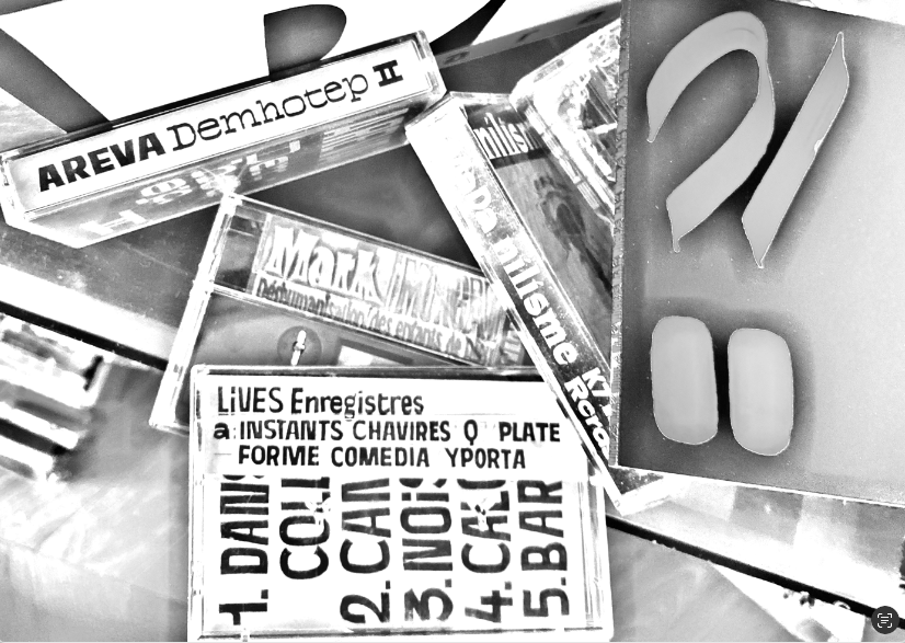
These impolite, textured letters, sometimes condensed or extended to the extreme to fill the narrow surfaces of these tapes, embracing errors and malfunctions like so many finds, are an echo of the music they carry. Unwritten music, which shun genre assignments and free themselves from the rules of composition, the traditional injunctions of melody, rhythm, technicality and virtuosity.
The name is an allusion to the material of machine-cut adhesive letters, whose arrival in the 1970s massively eclipsed, at least for a time*, the profession of letter painter in France. PVC typeface, whose point of departure is the painted letter, will in turn, as a digital typeface made of vectors, be able to be cut into adhesive letters by anyone and everyone, and to write any fascia: the irony of this infernal loop, a rebirth as much as an outright assassination.
This repertoire of proposals, made possible by unique textual content for limited, palpable surfaces, raises particular questions and later seeks answers in a transcription of an infinitely deployable and combinable system, imagined in the profoundly abstract space of the screen. A second life after reincarnation.
This inspiration from shapes produced in specific contexts, in specific formats, on specific materials and with specific textual content, creates possibilities but also a paradox: inscribing by hand means confronting and working in a tangible, limited space. It is also the possibility of working on the unique and the bespoke, the impact of a letter with a specific morphology on the one that follows it. Typographic design, on the other hand, seeks to perform within the logic of a system, made up of normative choices and syntheses.
PVC is not an ode to the signs of an idealized past, but a proposal for a contemporary, digital reading of signs obtained using a technique at least as old as the Roman Empire. It's a to-and-fro between two practices, two temporalities, two approaches with distinct stakes that try not to caricature each other, but to dialogue, feeding off each other without lying about their nature and the possibilities they offer: the immediate for one, the rational for the other, the throw-away and the reworked, the sketched and the sculptural. The power and constraints of systemic logic in typography. The charming and invigorating awkwardness of hand lettering in situ, sometimes beyond and sometimes not.
Read “The Essence of the PVC Font Family Unveiled”, published on Production Type Magazine.
Design: Hélène Marian. Production Type Team: Hugues Gentile, Jean-Baptiste Levée, Léa Bruneau, Arthur Schwarz.
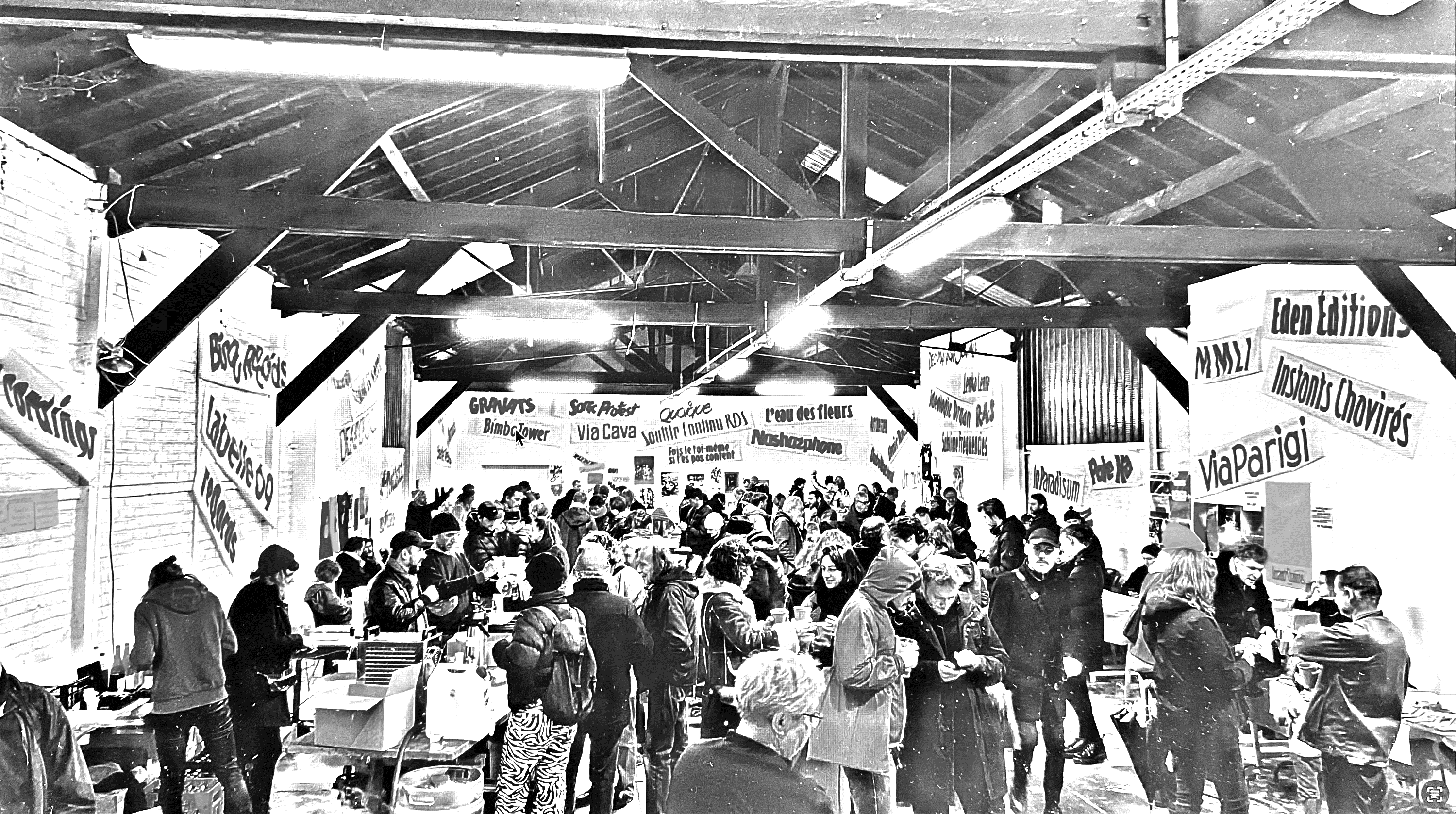
Scale 1:50
Banners painted with the names of the music labels exhibiting at “12h24–24h12”, unclassified music fair organized by Zone de Silence at Instants Chavirés, Montreuil, on December 9, 2023.
For me, the discovery of noise/experimental/improvised music was an invitation to shift and take a more direct approach, to question the framework of my profession and its instruments.
The autonomy acquired through practice, the ability to improvise letters without prior sketch, on a small or large scale, in any location and with only a brush and a pot of paint as equipment, enabled me to question both the graphic design commissioning processes to which I had become accustomed, and the very notion of commissioning. I went from being a spectator of a scene to an actor, learning from and participating in the practices of others. Working more and more with collaborators and less and less for clients, in less institutional/less hierarchical/less monetarized frames, where the aim is to construct an object, a moment, to contribute to a work by means of signs, to indicate a path and add meaning through form but also, therefore, through manner. To break away from the usual submission of sketches from a distance and think more spontaneously together. For me, getting out of the solitude of the studio and sharing the possibilities of the traced letter.
I began to multiply in situ interventions, porous to their context.
The 50 or so banners I painted to celebrate unclassified music at the Instants Chavirés music fair are just one example, preceded and followed by others:
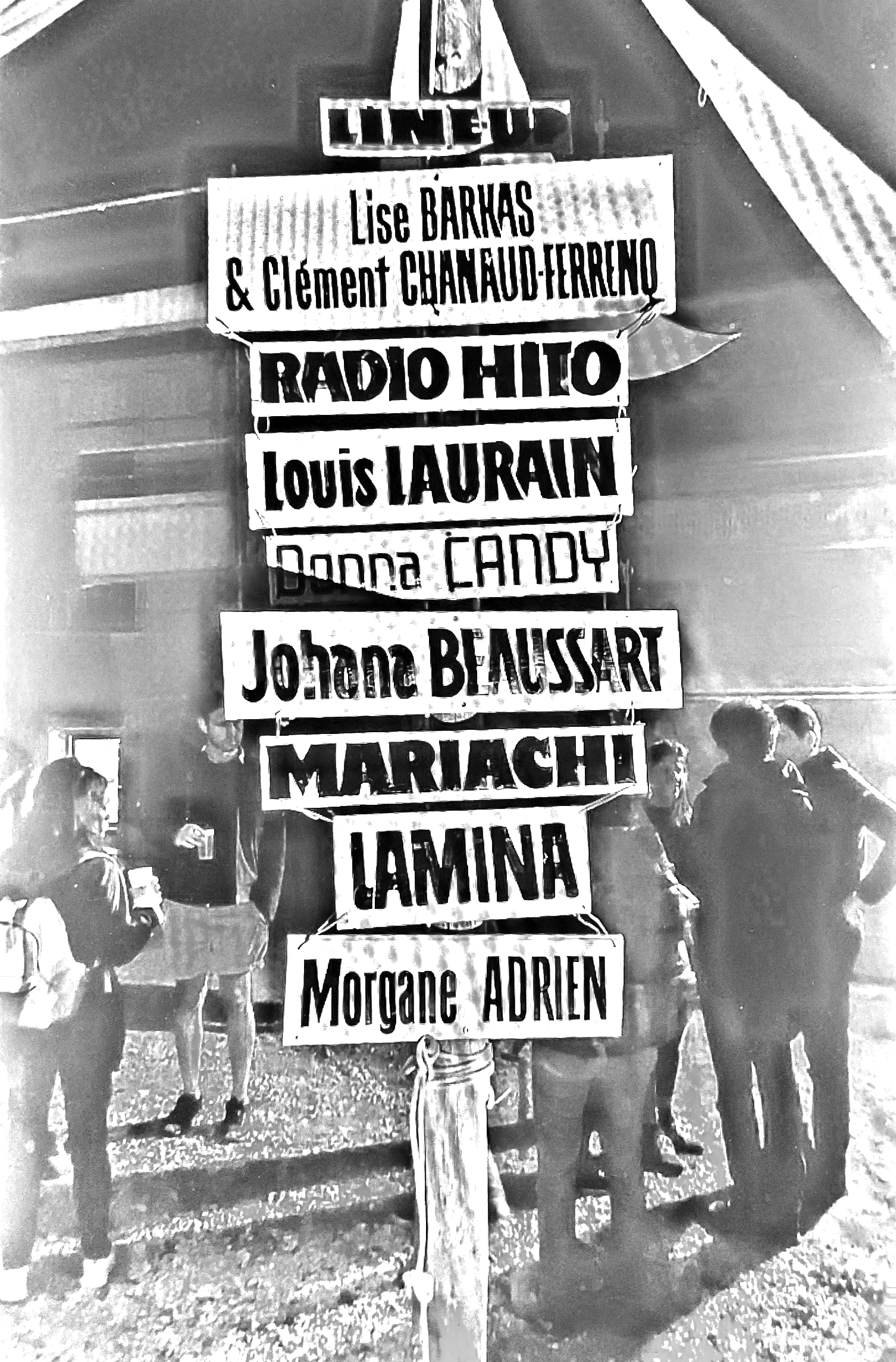
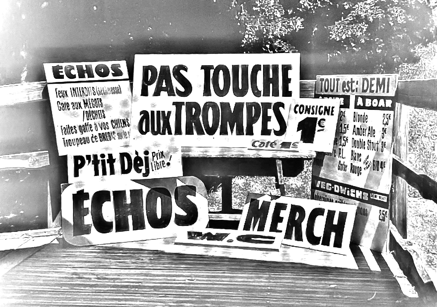
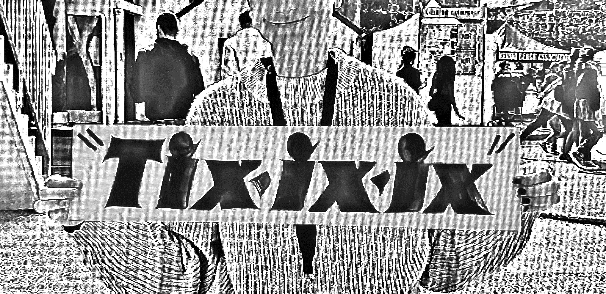
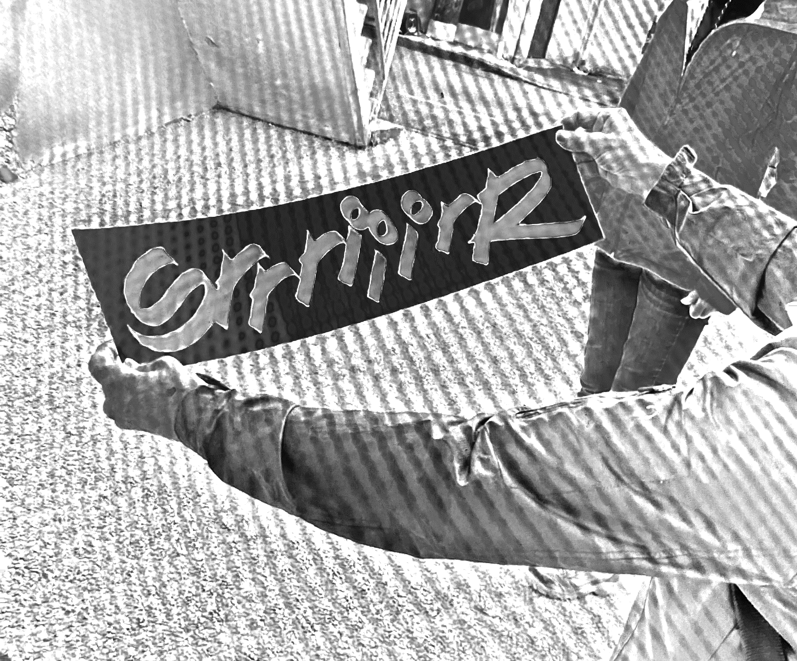
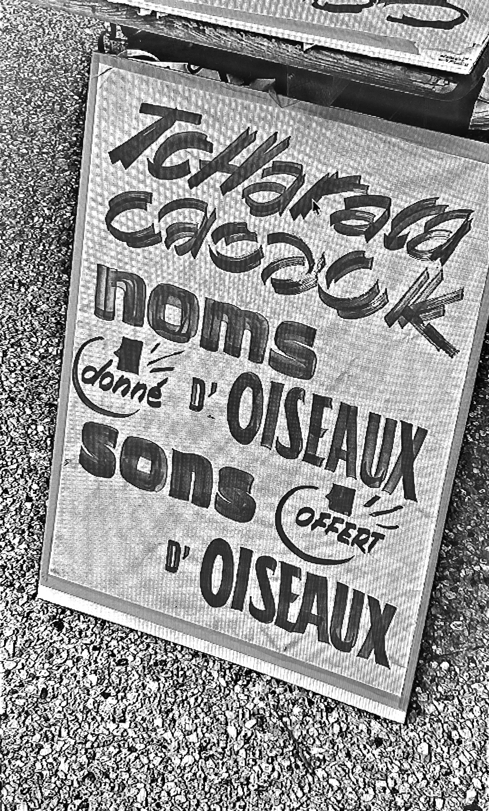
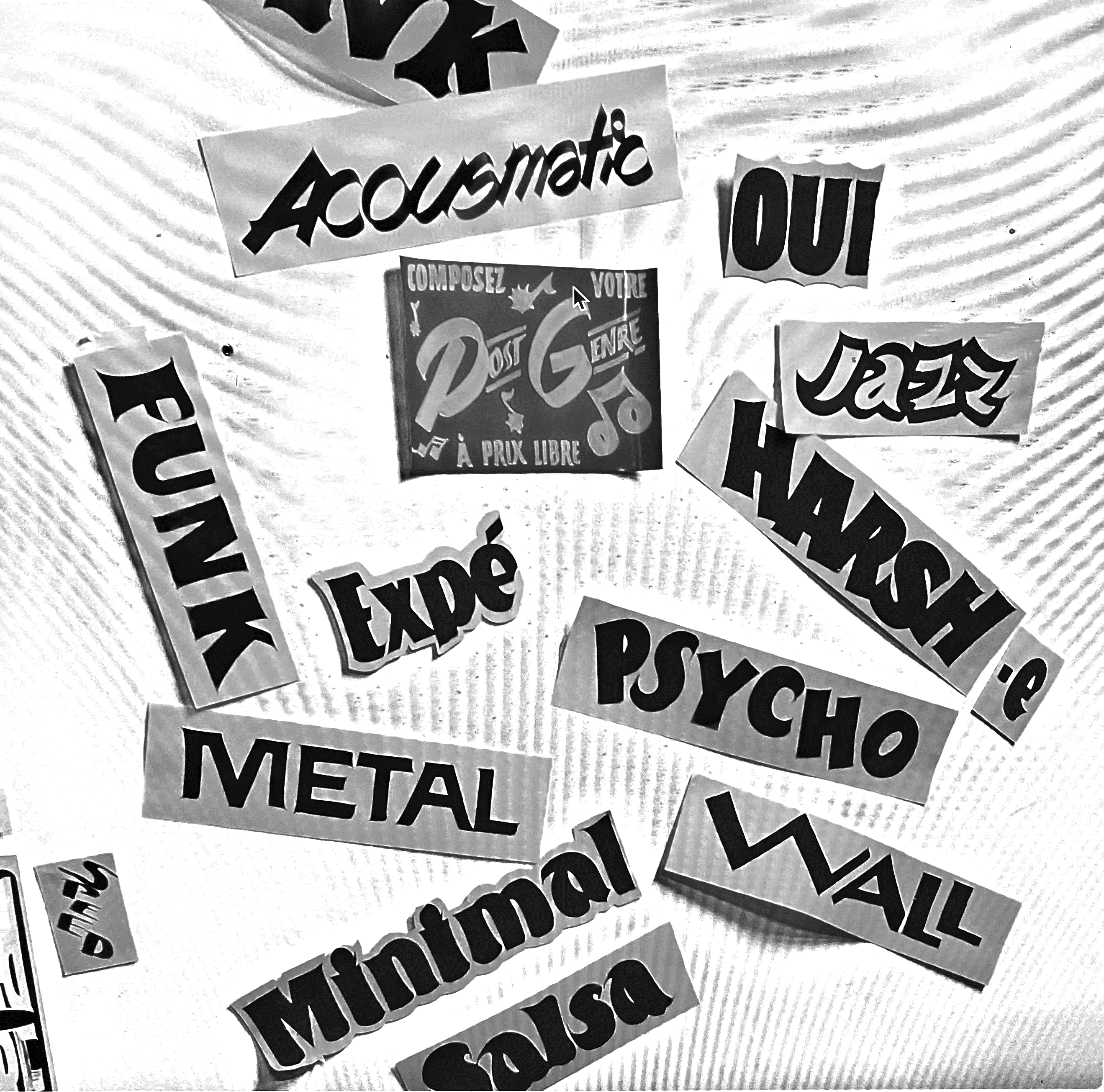
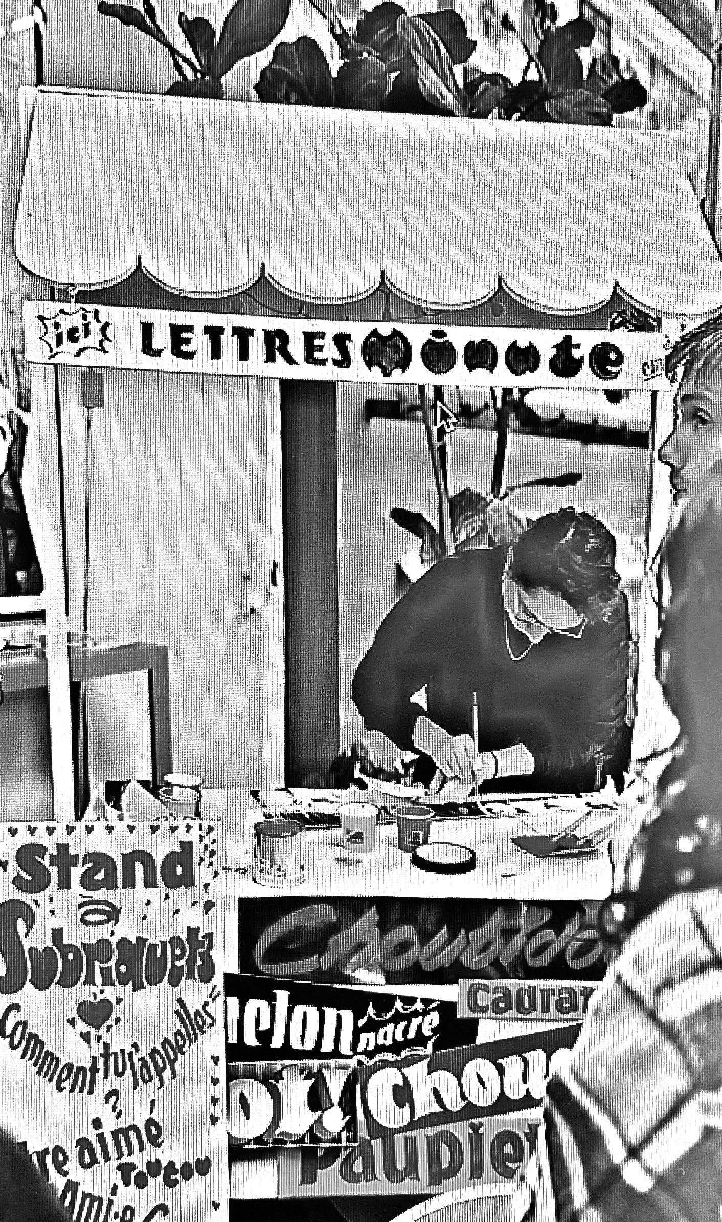
Each of these moments offers new formal possibilities, and I take immense pleasure in seeking out and producing with the words that are shared with me.
Does this face bear the seeds of a future typographic counterpart? The answer remains to be set.
* Editor's note: Except for the letters cut out by Chrystel Crickx, see La Perruque N.25.
PVC
Available for purchase at productiontype.com.
Loudy Letters. Traced, Designed & Laid Out.
Links:
helenemarian.com • Instagram