Words by Harrisson & Louis Garrigdo
English version | Lire la version française →
Issue N.27
Oct. 2025
Authors: Louis Garrido & Harrisson
Typeface: Not Comic
Designed at the occasion of a workshop at Académie royale des Beaux-Arts de Bruxelles, with Emma Arnaud, Florence Buron, Eva Foucart and Ketsia Gime.
Printed in the margins of:
Graphius, Ghent [BE]
± 400 copies
Love it or hate it, the Comic Sans MS is finally out of business because of the Not Comic. Straighten out by Harrisson and Louis Garrido and then revived by students in Visual communication from the Royal Academy of Fine Arts, Brussels, the Not Comic is portrayed throughout a comic composition inspired by a famous French caramel candy brand known for the jokes hidden on the back of its packaging: Carambar.
It was a fun experiment, though, to try and peel away the layer of everything that was wrong with Comic Sans MS and straighten out everything that wasn't straight, clumsy, hesitant and askew in his drawing. Was it possible to make a serious version? Behind the joke and the hundreds of clicks made with the Shift key held down, the result still made me uncomfortable. So this was the true identity of this omnipresent typeface, this all-too-familiar old clown? With his goofy smile and thick make-up removed, I suddenly had the strange impression of having unmasked an imposture that had been going on since the early days of PC. It was as if the specter of Zavatta tyrannizing his children had revealed itself behind the keys of my keyboard.
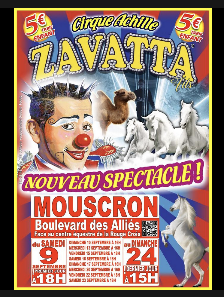
Contrary to popular belief, there are few circus posters composed in Comic Sans MS.
While it was very funny not to be funny anymore, it wasn't a pretty sight.
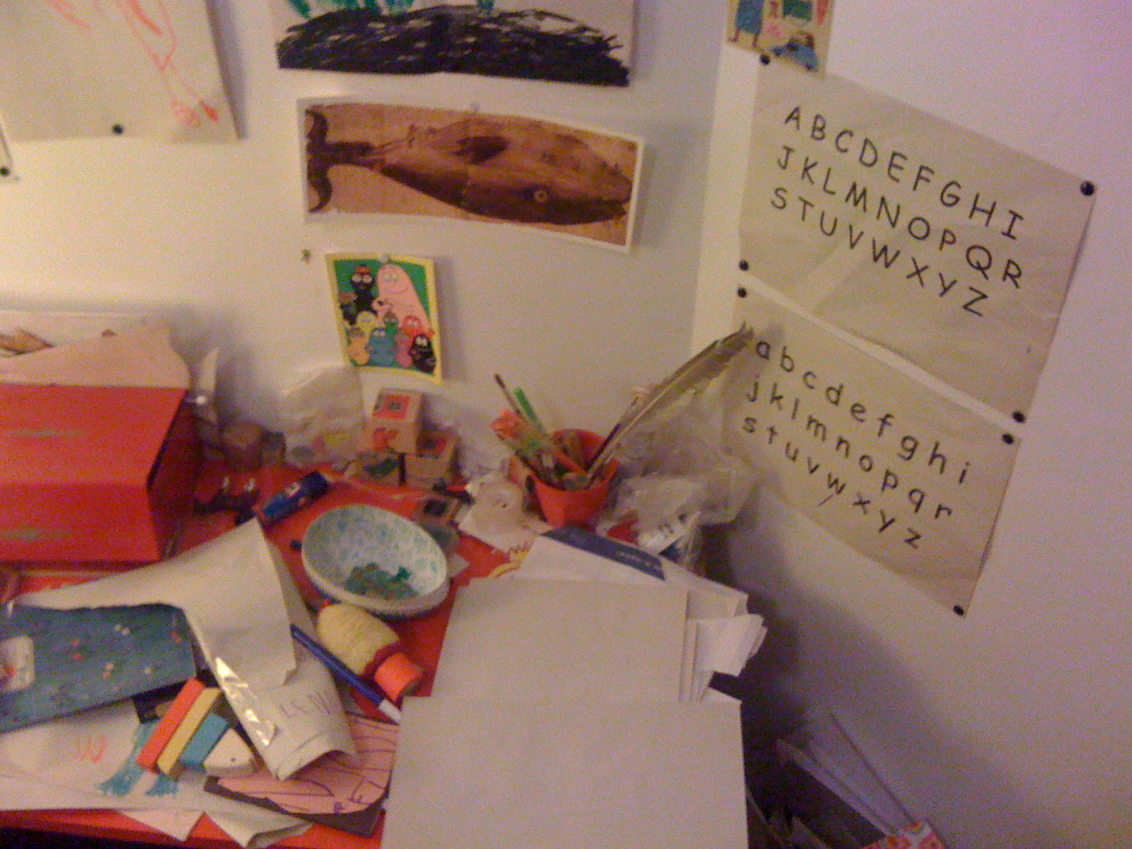
Lena M.'s desk (age 4) in 2013.
The story was old! More than a dozen years ago, I was astonished to discover the use of Comic Sans MS in French-speaking Belgian kindergarten classes. Rumor had it that a Ministry of Education circular had recommended its use. It is still used today by teachers to help students recognize the characteristic shapes of the different letters of the alphabet. The fact that Belgian children's first contact with letters was via a standard font from a proprietary American operating system says a lot about both the budgets allocated to public education and the resourcefulness of teachers in creating their own teaching materials.
As my daughter was learning to read at the time, the idea of the need to develop lettering adapted to learning to read and write in Belgian elementary school jumped out at me. Seeing her practicing on old Tintins albums, a first attempt at redesigning the lettering of this highly debatable Belgian cultural heritage seemed an excellent way forward.
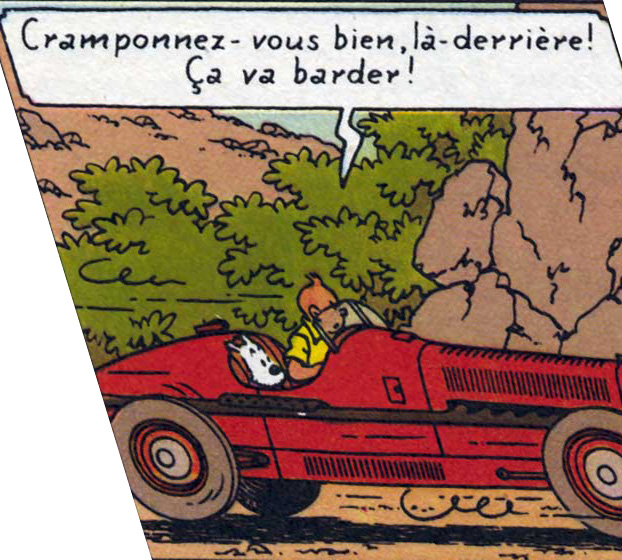
Tintin in reverse italics.
Propelling Hergé's letters into the public domain as teaching material for Belgian schoolchildren would have been an elegant local scandal, revealing the legendary greed and cynicism of rights management company Moulinsart Production. The attempt yielded only meager results: the PANPAN BOLD, which can be found in the OSP (Open Source Publishing) archives, and a slew of distressing, mean-spirited anecdotes about Moulinsart (now Tintinimaginatio).
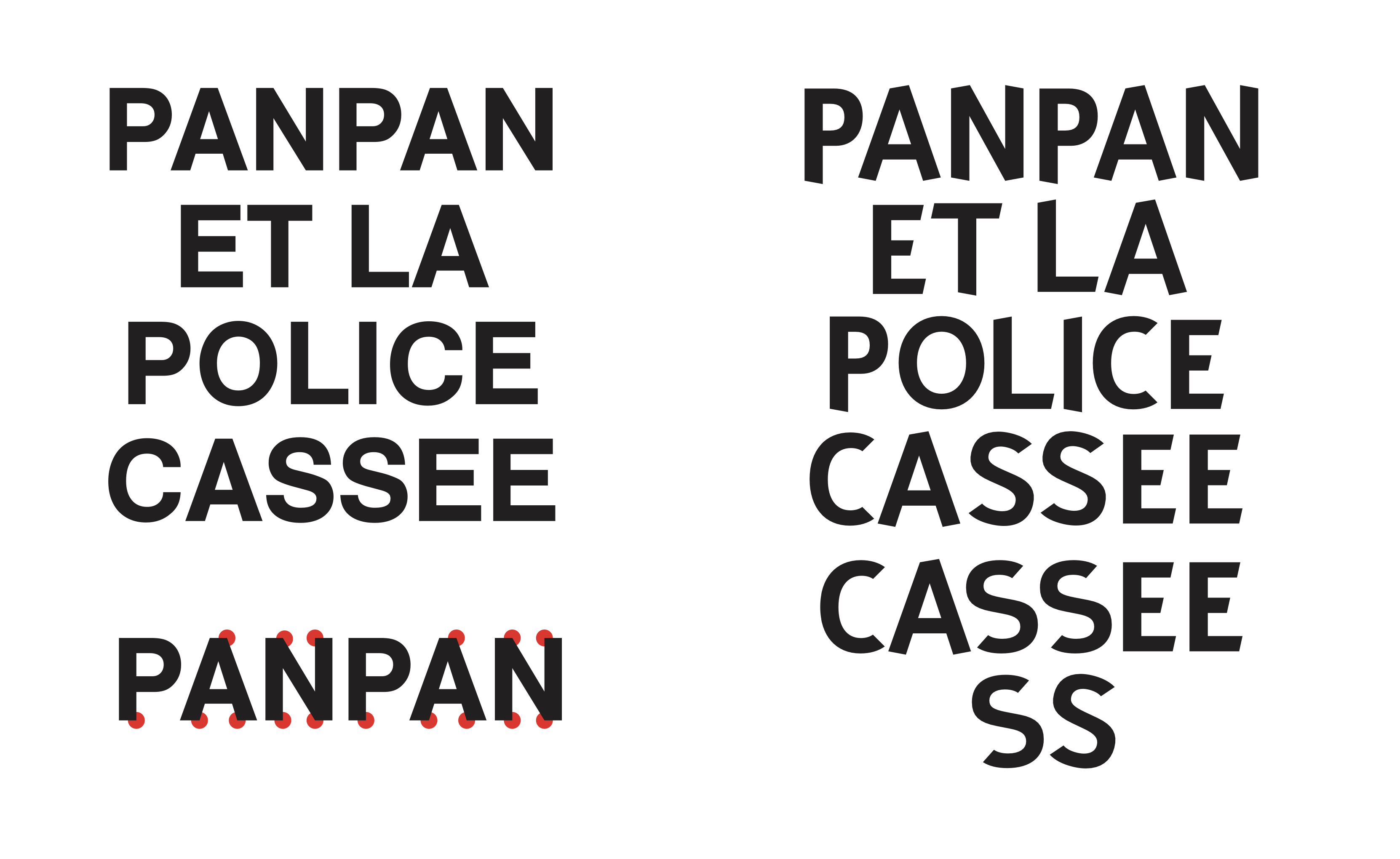
Panpan Bold.
Because there was another, equally spectacular possibility: that of making an open version of Comic Sans MS for use outside the constraints of Microsoft licenses. A “clone” version wasn't enough for me, I needed an extra flavor to make sense. Redrawing the Comic Sans MS by straightening it up meant stopping laughing.
So I made a first sketch on Inkscape and the result was more than convincing. In fact, it was really great. At the same time, Olivier Bertrand asked me to do an internship, and I offered to collaborate on this hot potato. The result was a version that wasn't quite dry, a little soft, that could still awaken a comic compromise. But it also resulted in an incredible proposal with serifs (the Not Comic Sheriff) that we absolutely must make happen in the future.
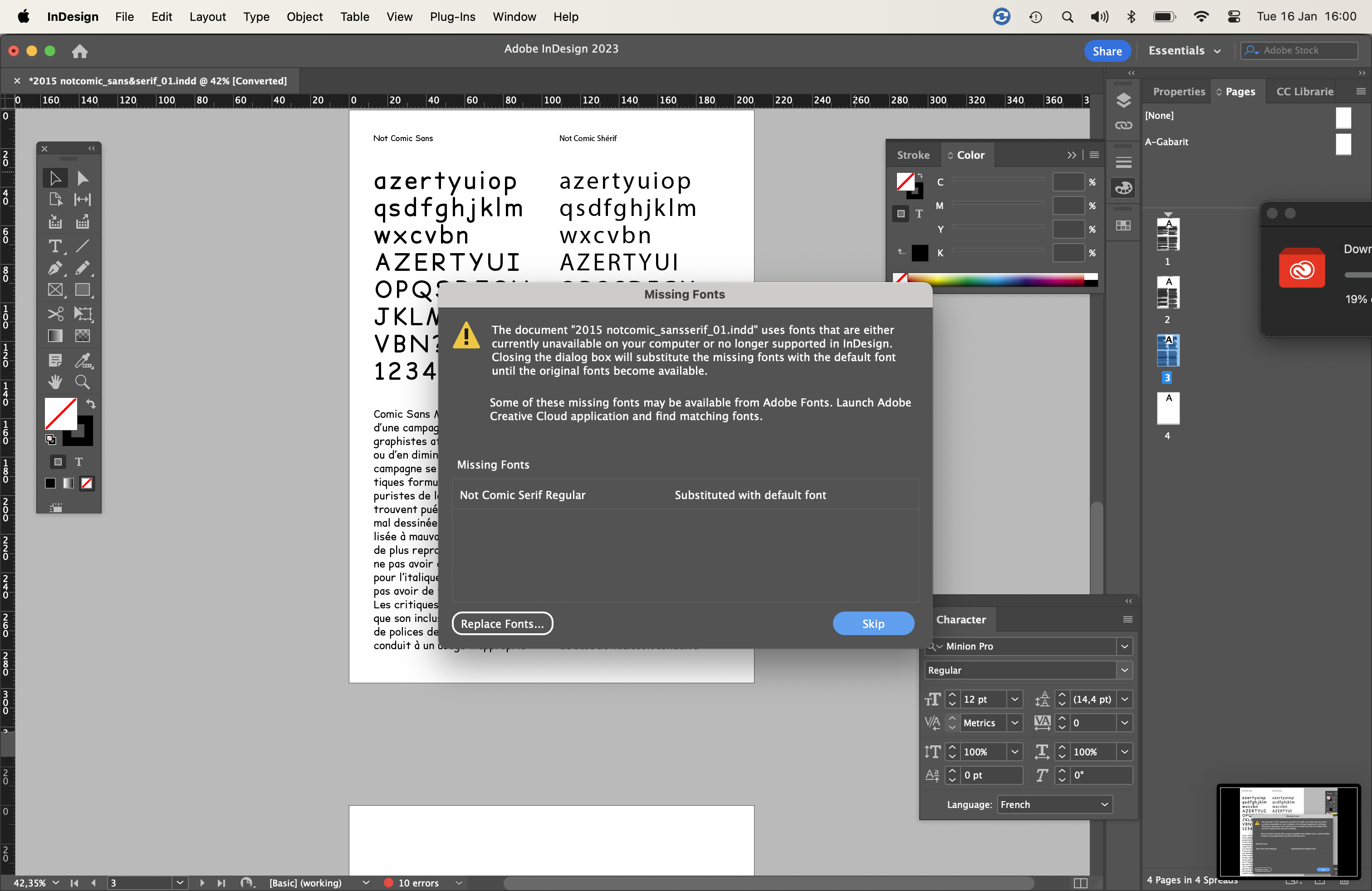
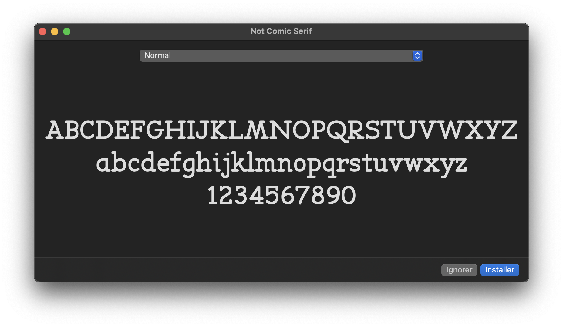
Everyone's asking for it.
The project fell back into the limbo of our hard drives once the internship was over. As my daughter could read, and I had other fish to fry, I had to boil the pot with more substantial financial ingredients to ensure the sustenance of my literate offspring. Graphic design isn't very lucrative when you indulge in these experiments for too long.
Nevertheless, beyond the pleasure of dealing with idols with hammers, this adventure has raised a number of reflections that motivate a slightly deeper questioning of this entity that is Comic Sans MS, and the meaning that its antinomic Not Comic can take on.
Designed in 1995 by Vincent Connare, to express the friendly tone of Microsoft Bob (a short-lived character who was supposed to accompany users through the Windows 95 interface), Comic Sans MS was conceived (some say in 48 hours) to make up for the urgent need to replace Times New Roman.
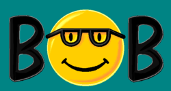
We'll talk about the Smiley affair in another article.
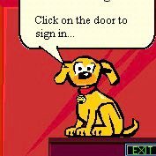
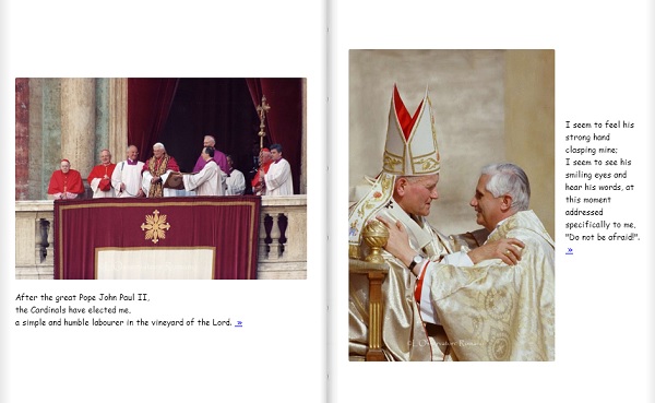
Jesus loves Comic Sans. Album commemorating the pontificate of Benedict XVI, 2013.
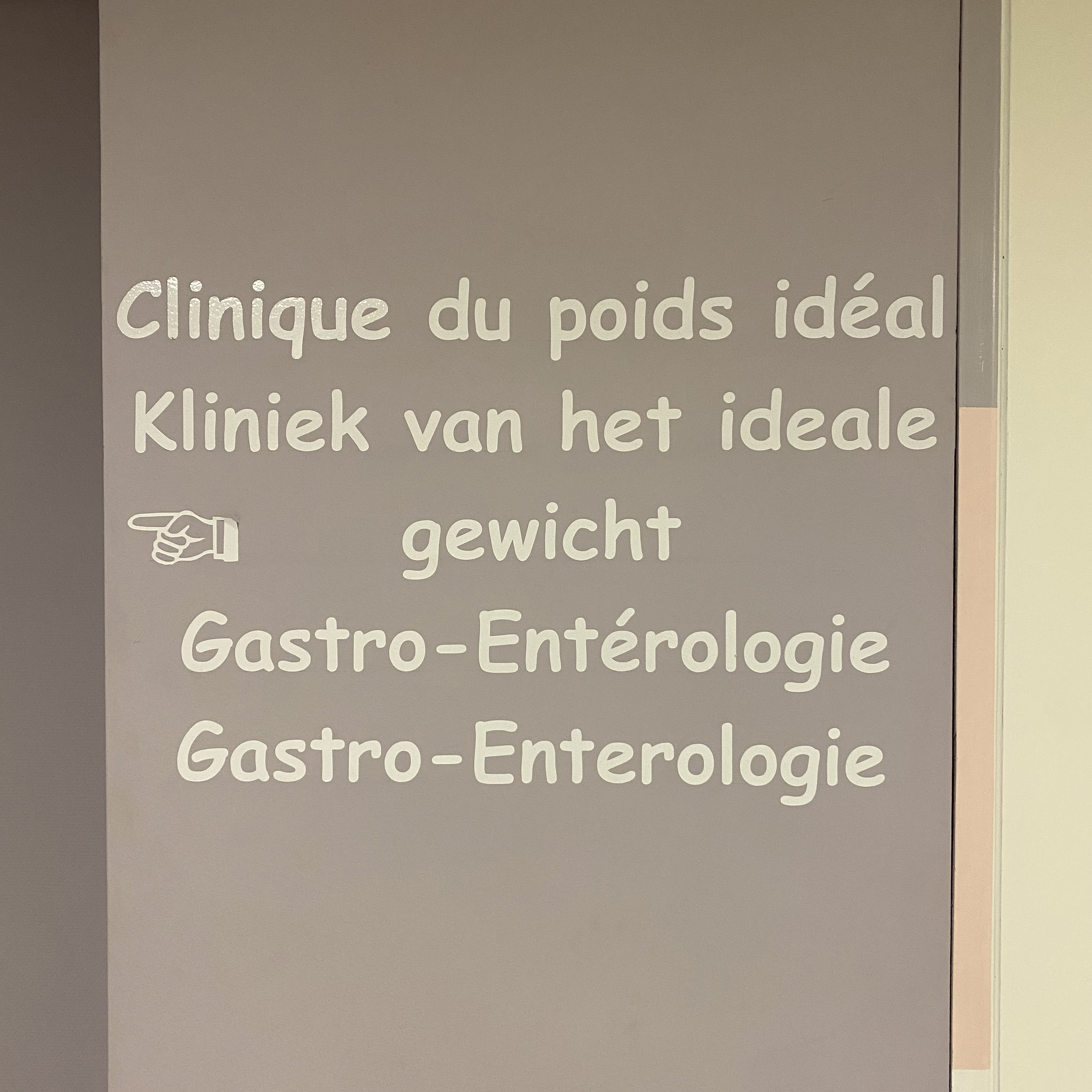
A digestible choice, both economical and sympathetic.
While the experiment of making it serious might have seemed like a provocation when I started the first straightening drawings, it turns out that this font has since returned to favor with its frequent use in today's spheres of graphic design. And it's with amusement that I observe the permanent cycle of “what-is-not-cool-today-will-be-tomorrow”, and vice versa. Nevertheless, it seems that the aesthetic question overshadows the real reason to doubt the good faith of Comic Sans MS.
For while a typeface can always be considered good or bad, beautiful or ugly, corny or fashionable, it's more difficult to consider it politically. It's perhaps important to remember that Comic Sans MS (and the system from which it sprang: MicroSoft) is in no way disinterested–quite the contrary. In fact, it is the Trojan horse of a soft power that has been at work in every corner of the digital world since the second half of the 1990s. If the Comic Sans MS has the status of a cultural icon, we mustn't forget the context of its production and what it conveys: helping Microsoft to impose itself hegemonically on the global IT landscape.
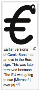
As a reminder, use of the Comic Sans MS is subject to the restrictive rules of copyright and intellectual property. It is forbidden to copy it and, above all, to modify it–and thus to wait for the designer's goodwill before adding characters such as the euro, a diacritic or an inclusive ligature.
In typography, there's no denying the class violence between the popular and the cultured, the ignorant and the elite. Although today's graphic designer is often a communication proletarian (remember that, thanks to legislation on proprietary software such as Adobe, graphic designer no longer own their tools), they nonetheless asserts their privilege as guardian of taste and visual values, as evidenced by debates on the aesthetic horror of Comic Sans MS. To add further fuel to the fire, we shouldn't be banning Comic Sans MS for aesthetic reasons, but rather for political ones.
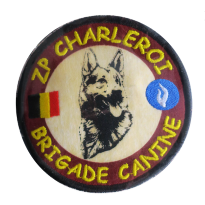
A fine example of cynologist indelicacy.
Because recently, with the Covid crisis and the urgent need to find solutions for off-site work and distance learning, public schools, from primary to higher education, have been taken by storm by proprietary Microsoft “solutions”. Teams, OneDrive, Office365... have flooded schools and their administrations.
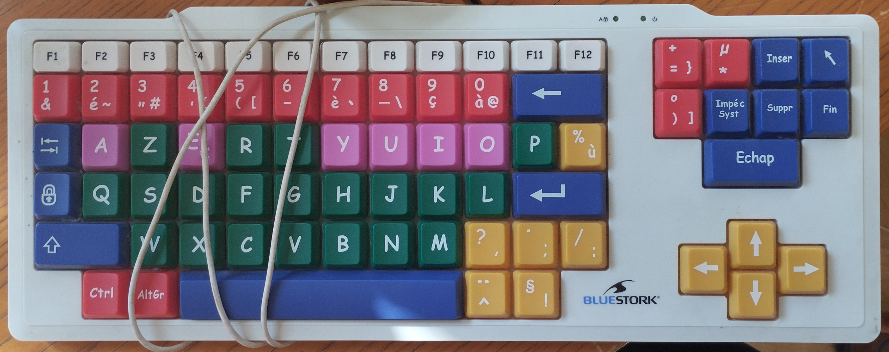
“The Revolution won't be set in Garamond”
All the communications and work of hundreds of thousands of students, teachers and researchers are now stored on servers whose use no one can control or check. In the space of 2 years of health constraints, all Belgian national education establishments (with very few exceptions) have been caught in Microsoft's captive net. It's a clear case of the monopolization of wealth and practices, combined with a rather harsh form of obscurantism.
Comic Sans MS's humor is like that of the playground when you hear an aggression punctuated by “I’m just kidding”: it's the idea of passing off violence as a joke, and thereby benefiting from the exercise of one's power. And that, paradoxically and ultimately, is where the idea of Not Comic lies: to burn its “funny” skin and reveal its programmed rigidity. Unmasking the implacable little Terminator hidden beneath the skin of the fake innocent child.
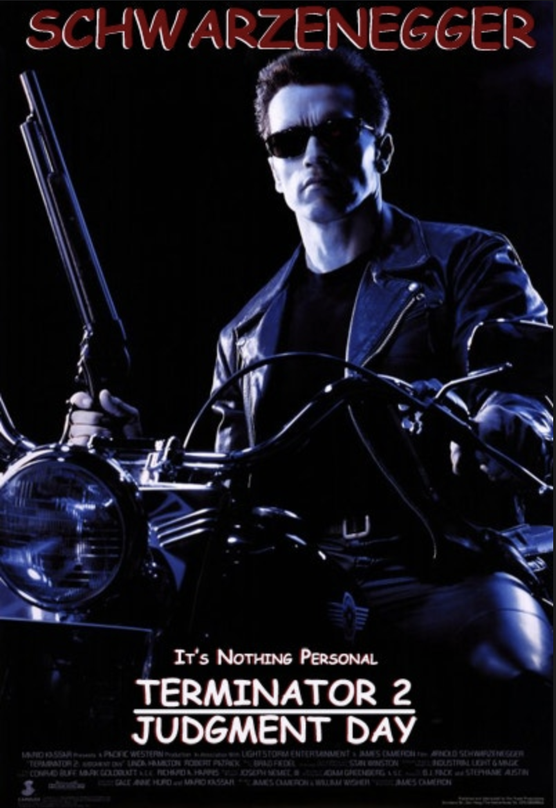
For many years now, the idea of an open-licensed Comic Sans MS has been a recurring joke in the world of graphic design and free software in particular.Not Comic is the answer. Not Comic, straight as an I, friendly as a garage door, but open to all your uses, modifications, redistributions, passions and hybridizations. A Not Comic font giving you the option of making serious what was funny at a time when what was funny was not. A Not Comic as a free alternative to Comic Sans MS, open to inclusivity and changes of style and genre. And then we'll be able to reread the Higgs boson declarations of 2012 with all the seriousness that the discovery of infinitesimal but essential particles requires.
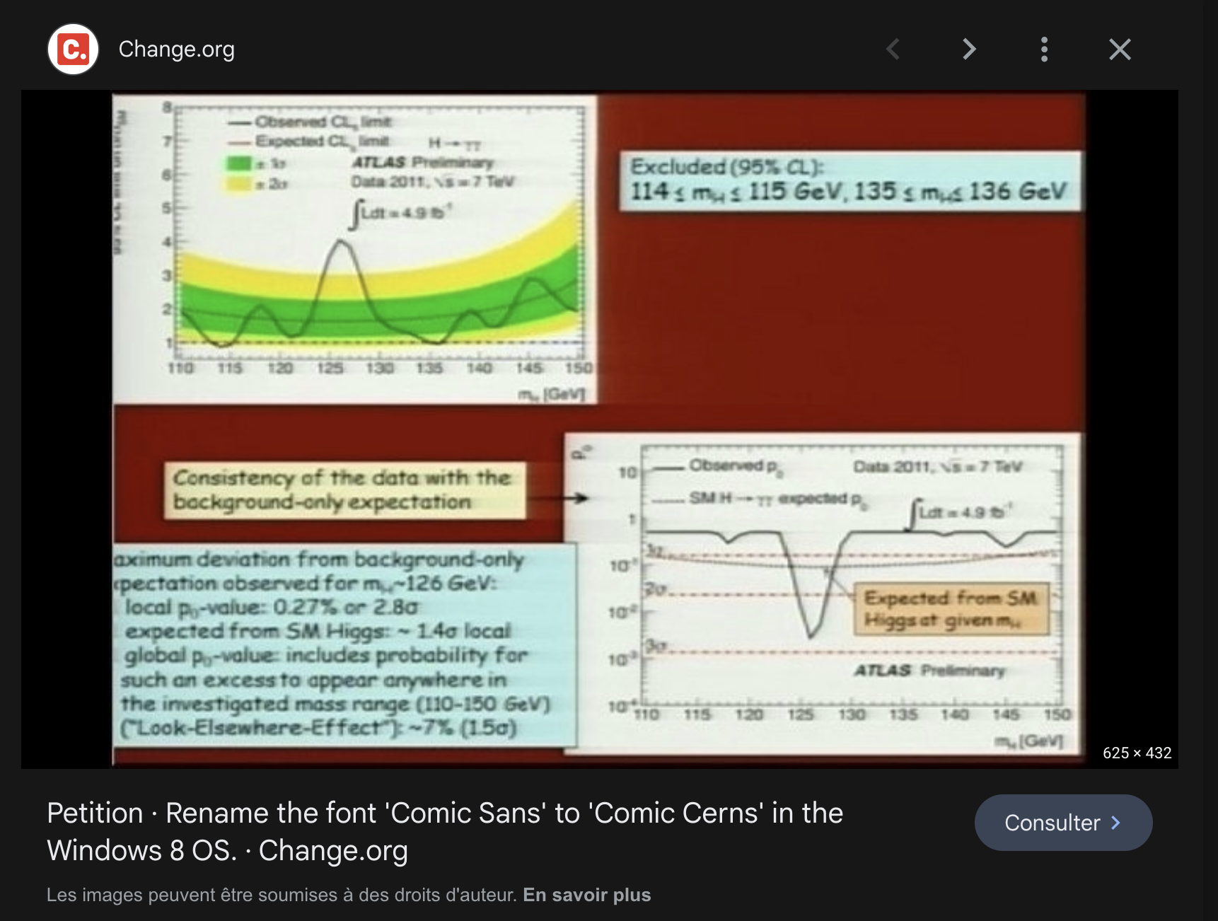
“When preparing my Higgs presentation, at first, I had Georgia on my mind, but when I saw the closely spaced, slightly squishy rounded characters in my drop-down menu, I knew in my heart that Comic Sans was the right way to go.” Fabiola Gianotti 01.04.2014
Beta versions of the Not Comic developed in 2015 by Olivier Bertrand circulated as confidential jokes in the Brussels open-source circle, schools and workshops.
It was Louis Garrido who unearthed the project a few years later. Having heard of the Not Comic story, and being committed to open-source values, he offered to make another version of it, putting the pressure back on the cocotte.
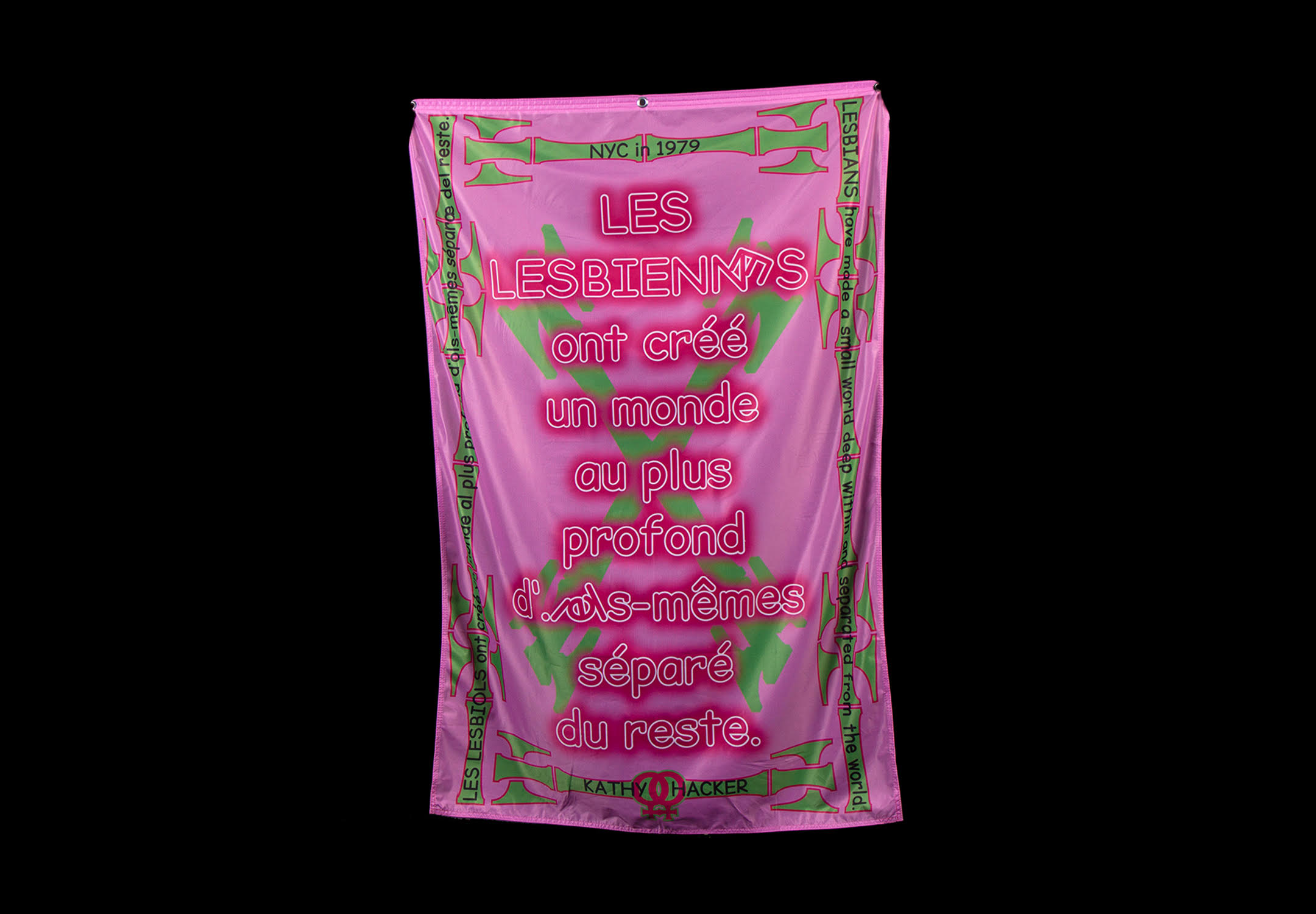
FDS (Fête du Slip), Les lesbienn·es ont créé un monde au plus profond d'i·els-mêmes séparé du reste. Mise en forme par Roxanne Maillet & H·Alix Sanyas based on an excerpt from New York City in 1979, Kathy Acker. Image : Axxenne
It was also Louis who proposed it to the Bye Bye Binary collective, resulting in the 2023 version augmented with inclusive glyphs by Enora Donniou with Roxanne Maillet.
And I'm glad that the paradox of removing comedy from a font can contribute to the seriousness of this movement's approach.
“What's with the s***** slides?”
— Vincent Connare on X (ex Twitter)
“Copy and reproduce.”
— Seven of Nine. Star Trek: Voyager, between 1995 and 2021.
In 2018, on the benches of the erg (École de recherche graphique, Brussels), I observe for the first time a singular typeface that catches my eye. A feeling of knowing it, but nothing on the tip of my tongue.
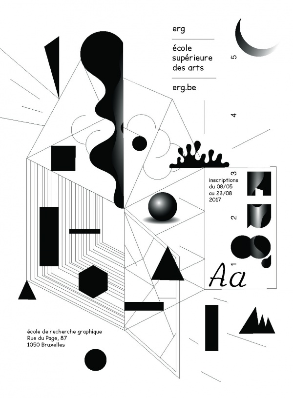
It structures a promo page for the erg typesetted by Harrisson, my Visual Communications teacher. Naturally, I ask him:
L — What typeface is that?
H — Oh, this? It's the Not Comic, I'm working on it.
L — Excellent, is it generated?
H — No, no, it's still “vector.ai”, but I'm on it!
In the weeks that follow, I hear about the typeface from time to time. How it came about, the idea behind it, references, motivations. The first tests are conclusive, and multiple versions are envisaged, some of them quite far-fetched. The scent of something big was gathering around the Not Comic project.But how far has the work progressed? There's not enough time to devote to it. The scaffolding of ideas is beginning to take its toll. They're stagnating this adolescent character. The project resembles that of the Law Courts of Brussels[2]. It's time to remove his braces and get him to articulate his first words.
A few weeks pass and a deal begins to take shape. Harrisson's proposal is simple:
H – A Samsung A4 laser printer in exchange for the character generated.
L – High five.
I get a pack with reference images, Olivier's drawings and Harri's designs. Let's go.
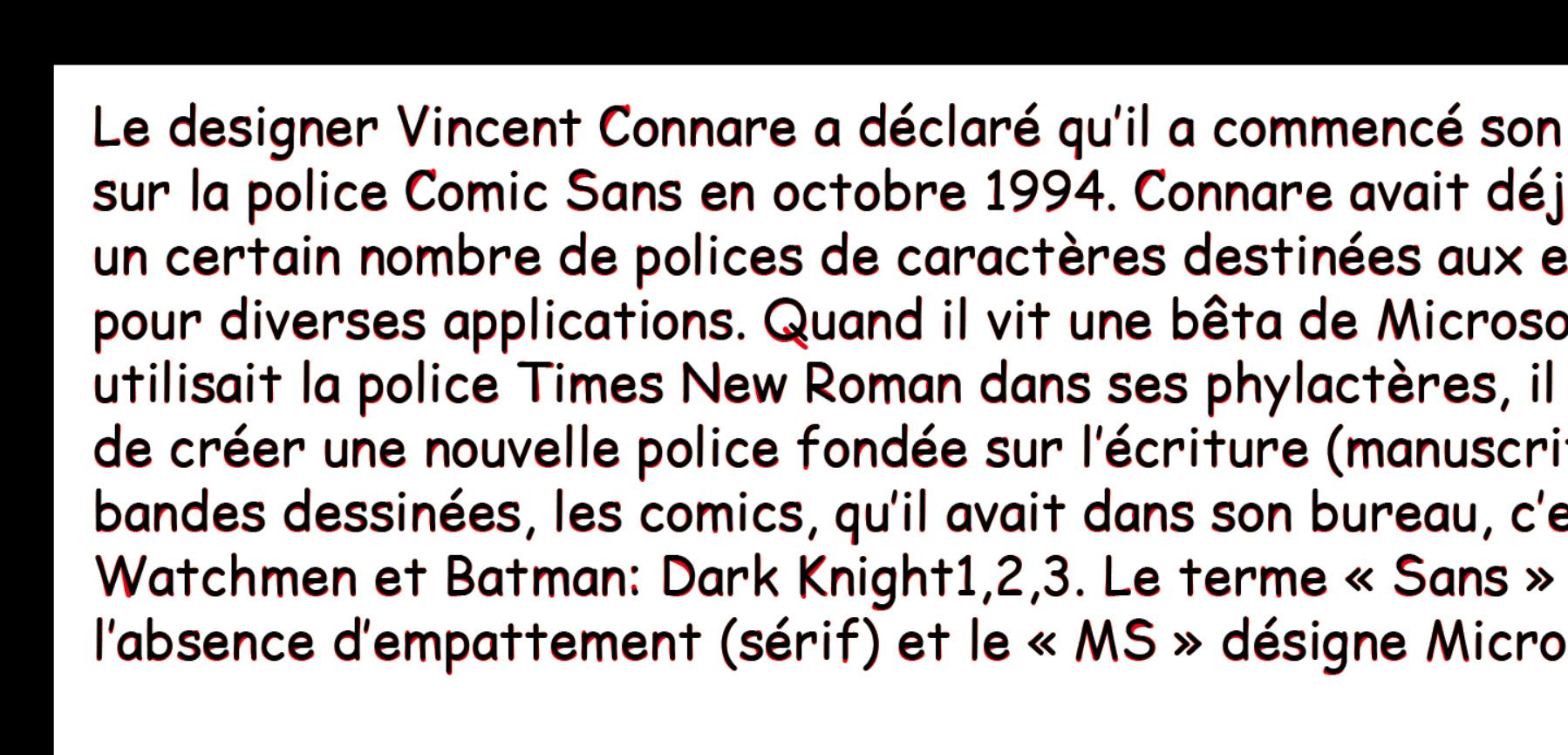
We recognize Comic Sans MS without batting an eyelid, thanks to its mole-like, singular curves. Vincent Connare's exaggerated lines are sad and funny at the same time. Their spontaneity reminds me of the note we write and leave on the corner of the table for a loved one.
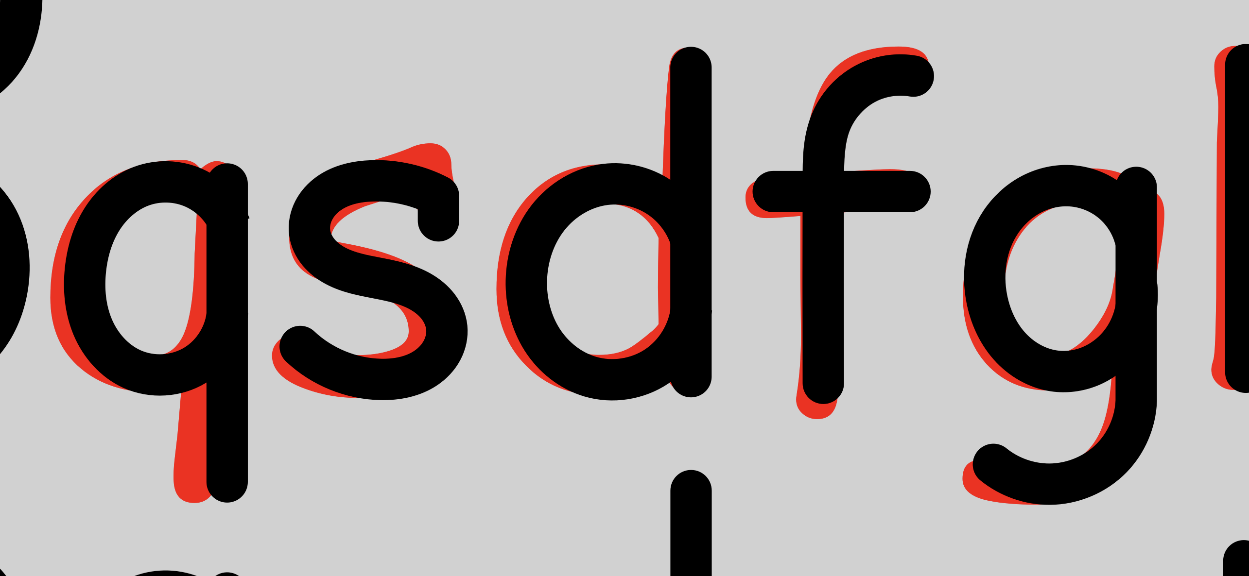
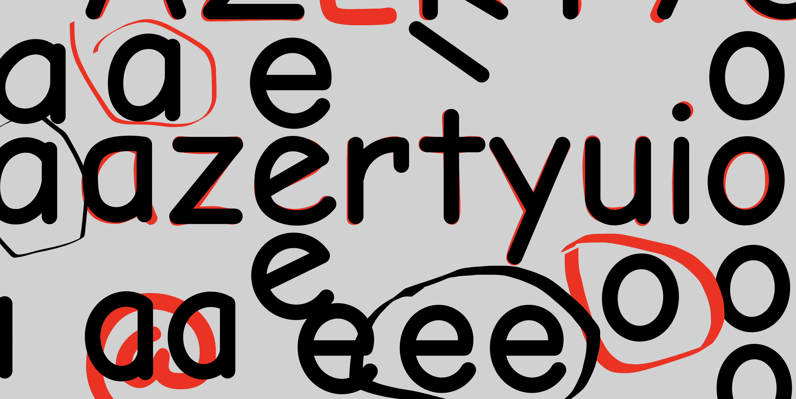
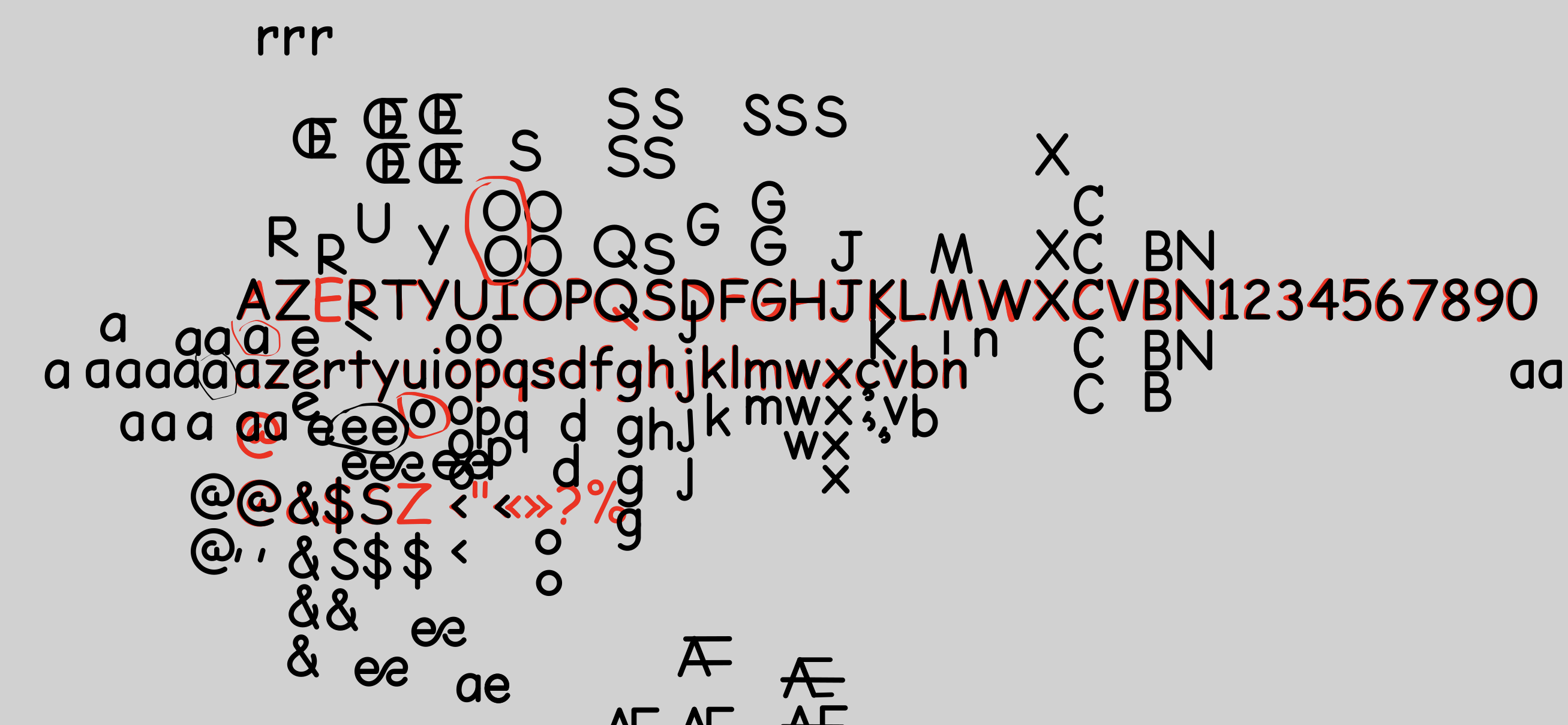
Work in progress. In red Comic, in black Not Comic.
Comic Sans MS is also THE typeface whose letter spacing also contributes to its identity. What sets it apart from almost all other typefaces is its frequent use by hobbyists. We're not going to give a lecture on “how to set the approach for a given type size”, but what I'd like to emphasize here is that this approach value remains unfailingly at 0 in most of the Comic Sans MS applications I've observed. The conclusion to be drawn is that in a large body (for a school fair, for organic eggs at the market or for hospital signage) there's plenty of space between the letters: wide-spread baby teeth that give it its charm.
However, I had to keep the glyph width and approaches intact so as not to destroy the whole singularity of the typeface (multiplexing, in other words).
So I copied the Not Comic characters from Inskape and pasted them into Fontlab, meticulously replacing their previous occupants.
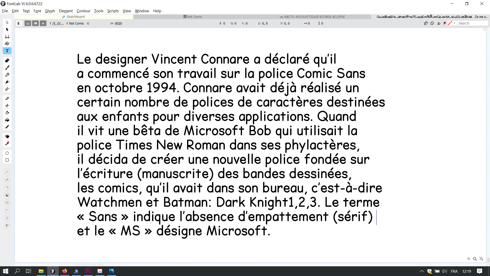
This interim version was published in Médor magazine (no. 21). Médor promises independent, hard-hitting investigative journalism, but it's also a medium for free tools and experimentation. The only magazine printed on a large scale in which an incomplete typeface riddled with problems of approach finds its place.
For this issue–visually piloted by Ludi Loiseau and Antoine Gelgon–we were preparing the layout for an article by Alix Dehin on nurseries, mismanaged, neglected and crying babies. A perfect first meeting for Not Comic.
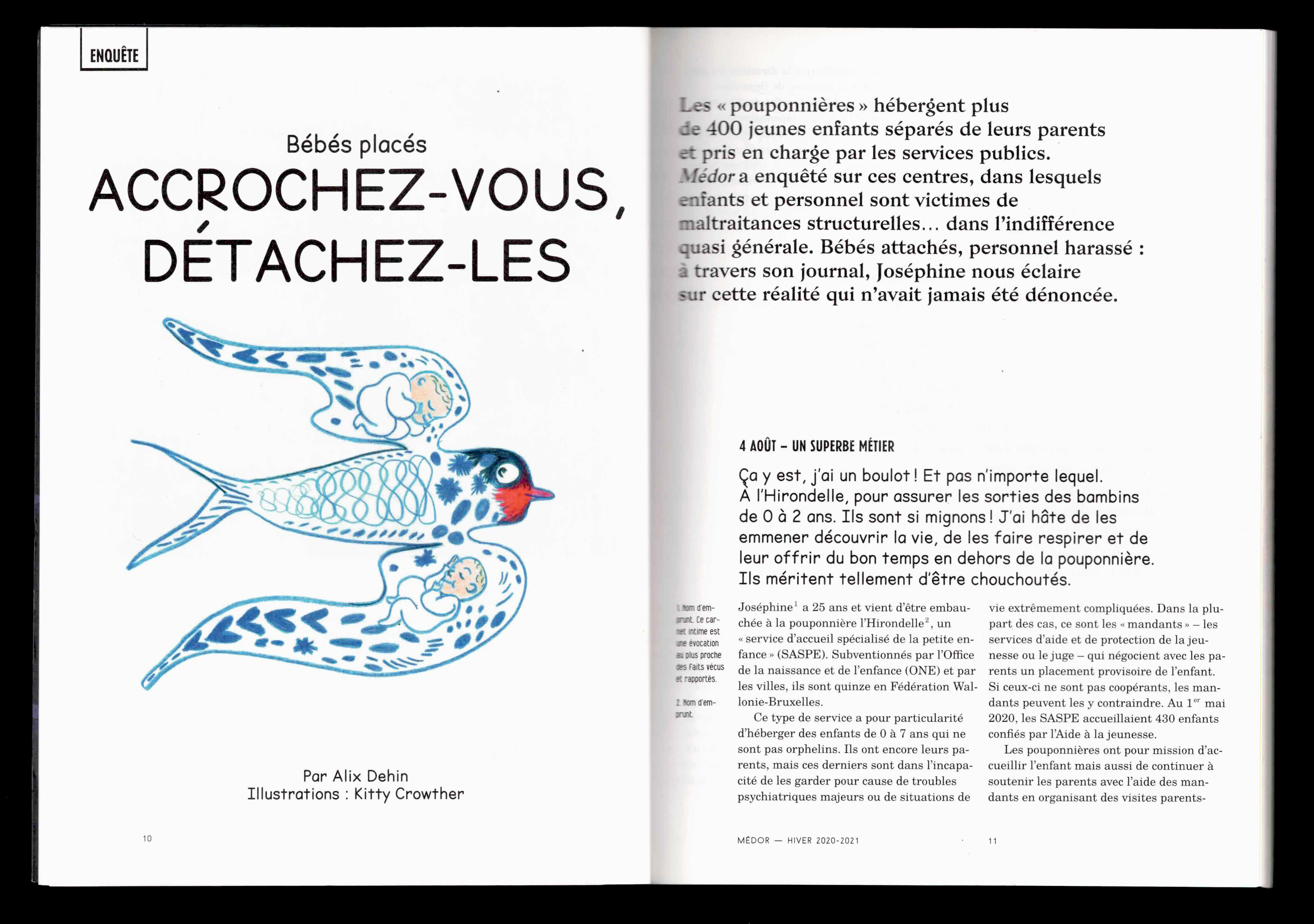
Médor magazine, no. 21, winter 2020–2021, 10–11.
Having been connected to Bye Bye Binary since the first workshop at RoSa vzw in 2017, it seemed obvious to me to add an inclusive panoply to this Not Comic, to free it definitively from its doppelgänger Comic Sans MS.
If it was important for me to inscribe inclusivity in the veins of this typeface, I had to find a way to do it. Simple monograms or ligatures were not, in my opinion, singular enough.
So I decided to add a little comic relief. What if these letters, which at first sight seemed cold, weren't actually filled with joy? Couldn't they convey the message of non-binarity by playing with their bodies? The idea was to personify the letters anew, dressing them up in eccentric roles and positions. The base line as floor, the shafts as legs and the counterforms as limbs. Pareidolia everywhere, we laugh.
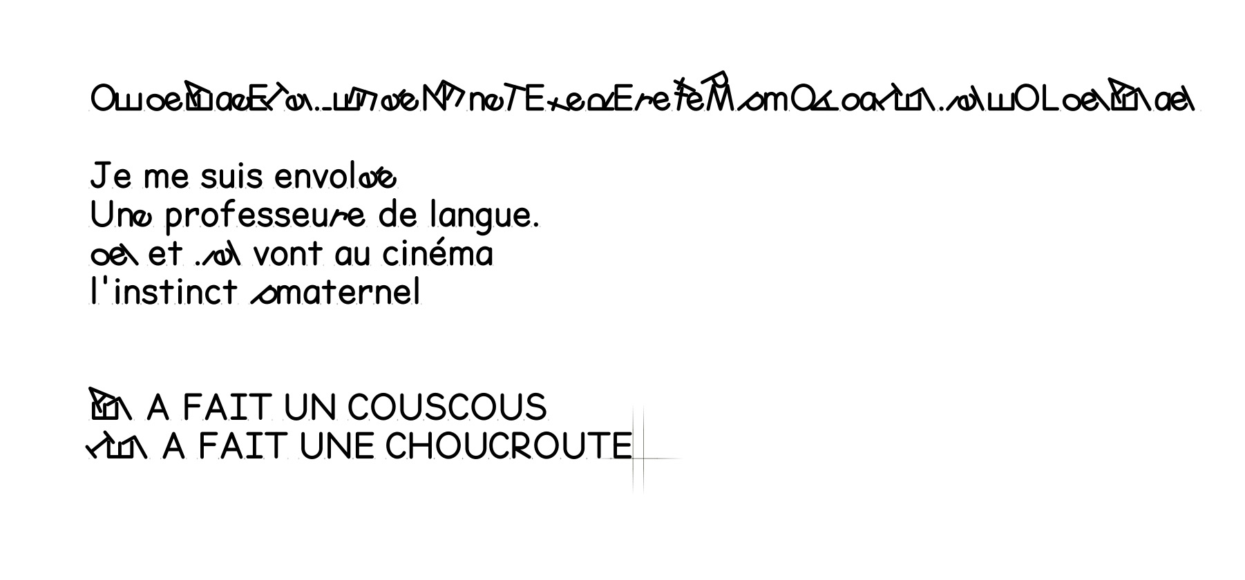
2022. Despite this impetus, I ended up putting Not Comic on the mantelpiece, not so much as a trophy, but more like a Mother's Day present from elementary school. It's cute, it could have made something pretty, but it ended up gathering dust at Grandma's.
More or less advanced versions of the font have circulated over the years, with or without inclusive characters (I've only drawn a dozen).
I think I got it from my father. One day, determined to repaint his shutters, my father (who can't see colors) took them off their hinges and gave them a coat of pistachio green paint. Instructions for use: 2 coats. Drying time: 6 h. Current time: 4 p.m. Night approaching: shutters up. As you'd expect, they've never had a second coat. Yet this green, chosen by an achromat, wasn't so ugly. In a double coat, it would have awakened the street. But the half-colored wooden boards kept masking tape on their hinges for another 10 years, until they were finished.

Dear Louis,
How's it going?
I hope all is well!
I'm working on a little journal for the Kandinski library in Paris and I'd love to play with the Not Comic. Could you send it to me? I think the one I have isn't up to date.
Thanks, big kisses. BTW, I'm coming to Brussels next week.
Roxy
A quick flick of the feather duster and I send the package to Enora Donniou–then interning with Roxane Maillet–who completes the inclusive kit. Not Comic is out of the incubator. An incubator that had kept it warm for many years. A long development, but a life assured.
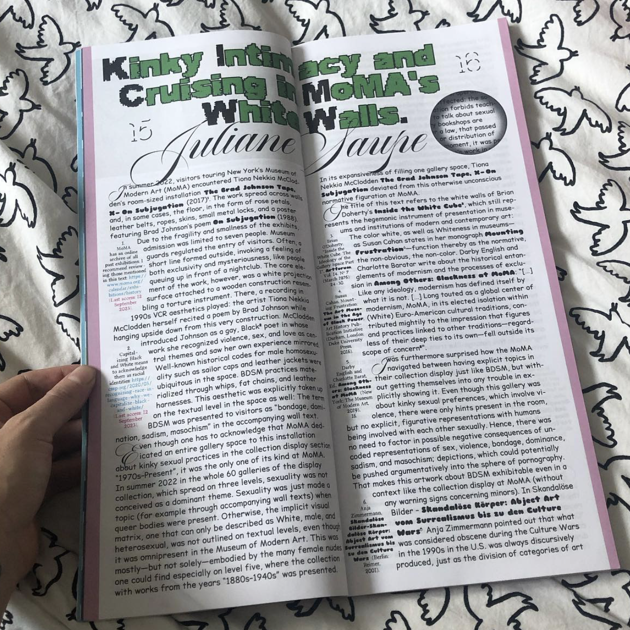
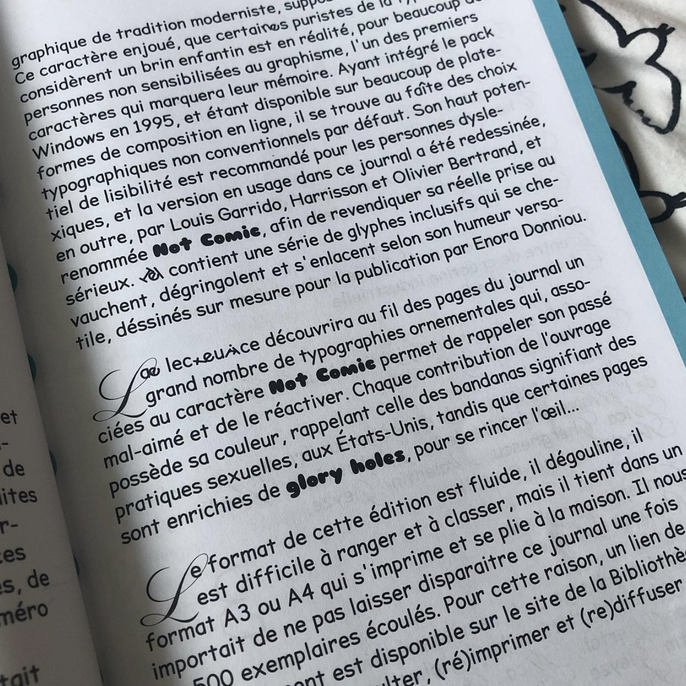
Journal de l’Université d’été de la Bibliothèque Kandinsky, n° 9, « Draguer » le musée et ses sources : la queerness face aux archives, 2023. Design: Roxanne Maillet.
Kisses to everyone,
Louis & Harri
Notes
Today, any search for Comic Sans MS automatically replaces the Arial in the results list with Comic Sans MS itself... Try it! ↩
Inaugurated in 1883, the Brussels Palace of Justice is an imposing building designed by Joseph Poelaert. Launched in 1984, the building's restoration campaign has not yet been completed, due to numerous delays and bad decisions. Its surface area is larger than that of St. Peter's Basilica in Rome. ↩
The integrated tool for the Adobe suite and all major character design software. ↩
Each point has two out-of-track handles for adjusting the angle and tension of the curve. ↩
Not Comic (SIL Open Font License)
Available on notcomic.harrisson.be.
Harrisson/Joël Vermot
Born in France in 1972. Live in Brussels since 1993. Works as a graphic designer since 1998. Teaches graphic design and typography (ERG, Brussels, Art2, Mons) since 2003. Studied History and Archeology in Strasburg (1993). Studied graphic design in Brussels (1997) and was a researcher at Jan Van Eyck Akademie in Maastricht (2006). Worked with Open Source Publishing (2006–2011). Worked mostly for cultural associations and institutions. Is currently focusing on teaching methods.
Links:
harrisson.be • Instagram
Louis Garrido (1991, Montpellier) lives and works in Brussels since 2014. Visual artist, graphic designer, typographer and illustrator, he questions design through the uses of a large range of tools from adobe suite to free/libre open source softwares. He is a satellite member of OSP. With an original Roland plotter, loulou translates vectorized drawings onto paper. As a glaneur and flea market devotee, he’s often inspired by notions of accumulation and the singularity of the items he encounters. His work ranges from a medieval aesthetic to contemporary drawing techniques, sometimes shifting from concise results to abstract ones.
Links:
louisgarrido.com • Instagram