Words by Olivier Bertrand
English version | Lire la version française →
Issue N.22
Sept. 2021
Authors: Julien Braeckevelt, Christian Matriche, Marie Sion, Eugénie Zuccarelli
Typeface: Correspondance
Type designer: Radim Peško
Printed in the margins of:
Graphius, Brussels [BE]
± 200 copies
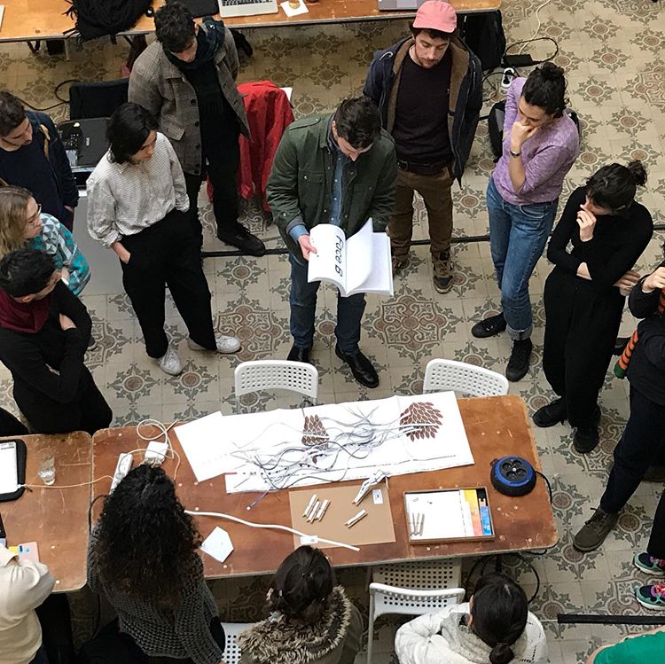
This special issue has been designed in the context of a workshop during Fig., the graphic design festival in Liège. Workshop participants were invited to edit and design the specimen of Correspondance, a font by Radim Peško. By designing the content and the form, they had to interpret the conceptual foundations and the graphic features of this font. At the same time, they had to find graphic ways to show the characteristics of the typeface. Here we stop a few hours for a train connection at the Liège-Guillemins station.
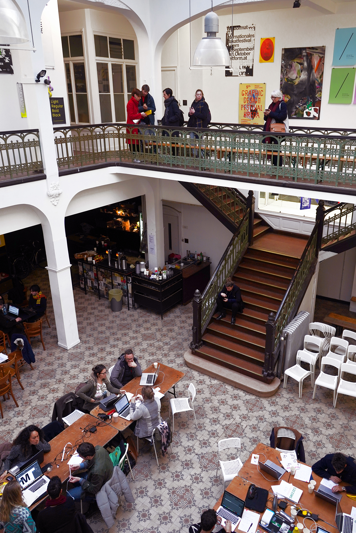
Workshop during Fig. Festival, Liège, Feb. 2020.
Photo: Gilles Dewalque.
Fig. is a graphic design festival taking place in Liège in February. It offers a program of conferences, exhibitions, workshops and round tables, aimed at a wider audience. Fig. is organized by Loraine Furter, PLMD & Signes du Quotidien.
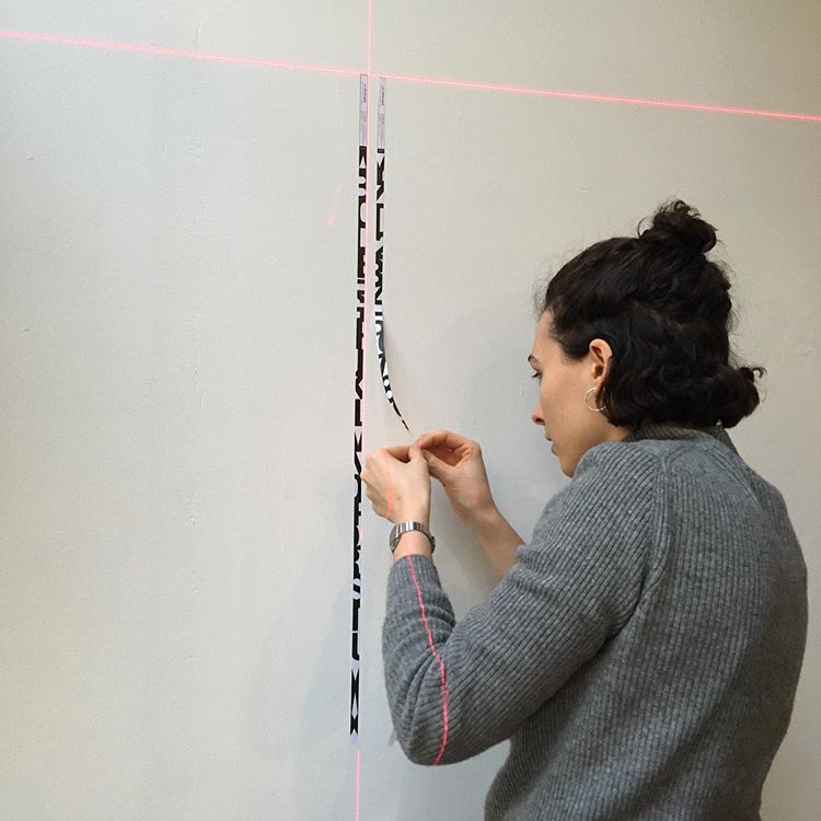
Workshop participants were invited to edit and design this special issue of La Perruque: the specimen of Correspondance, a font by Radim Peško. By designing the content and the form, they had to interpret the conceptual foundations and the graphic features of this font. At the same time, they had to find graphic ways to show the characteristics of the typeface.
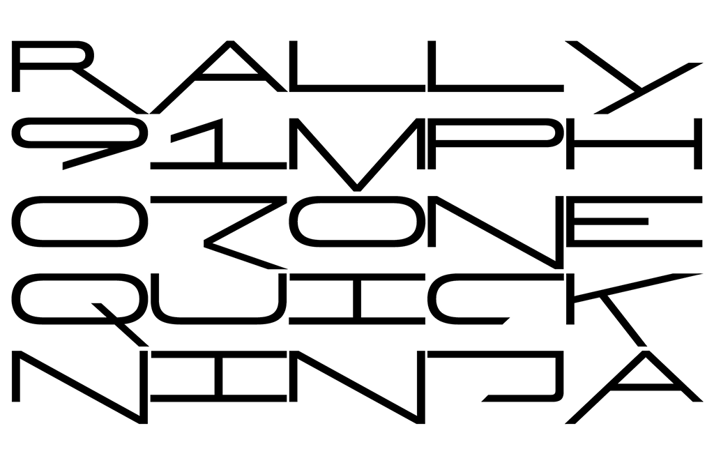
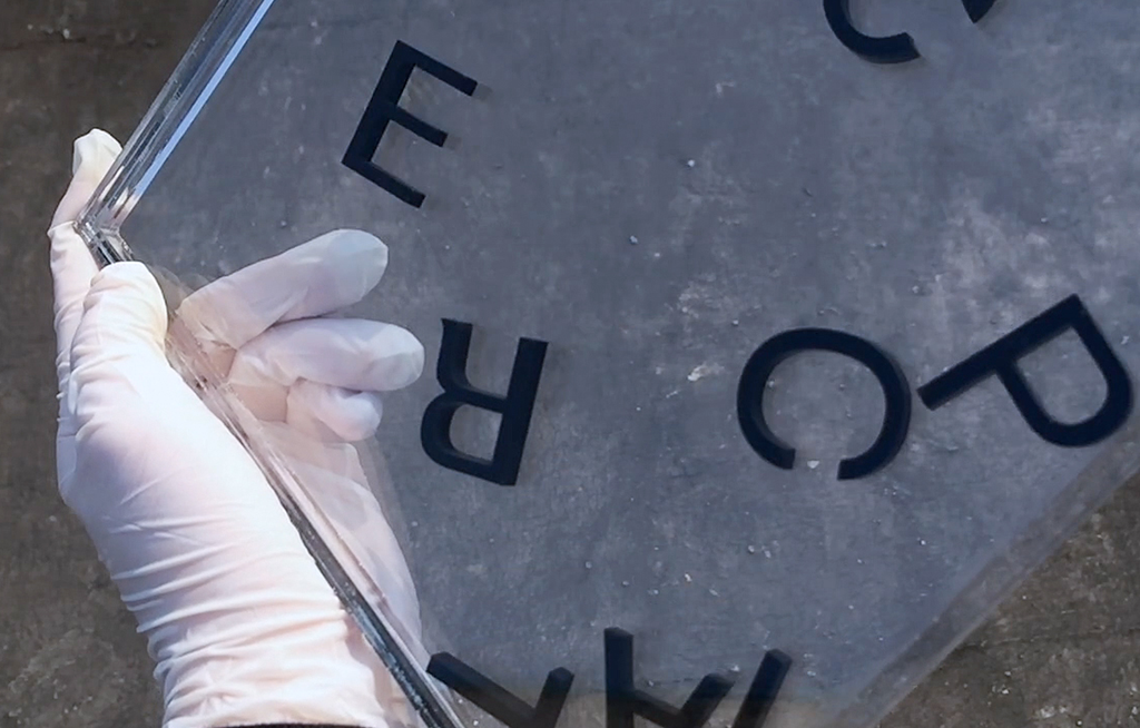
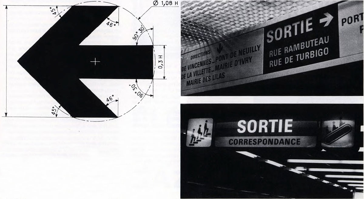
Correspondance is inspired by the typeface created for the Parisian Metro signage system by Adrian Frutiger and reconstructed by Radim Peško from memory. It features a single weight, upper case only, and alternate versions of some characters.
Workshop during Fig. Festival, Liège, Feb. 2020.
Grouped into editorial committees, the workshop participants experimented with the format of La Perruque by proposing different editorial and graphic approaches.
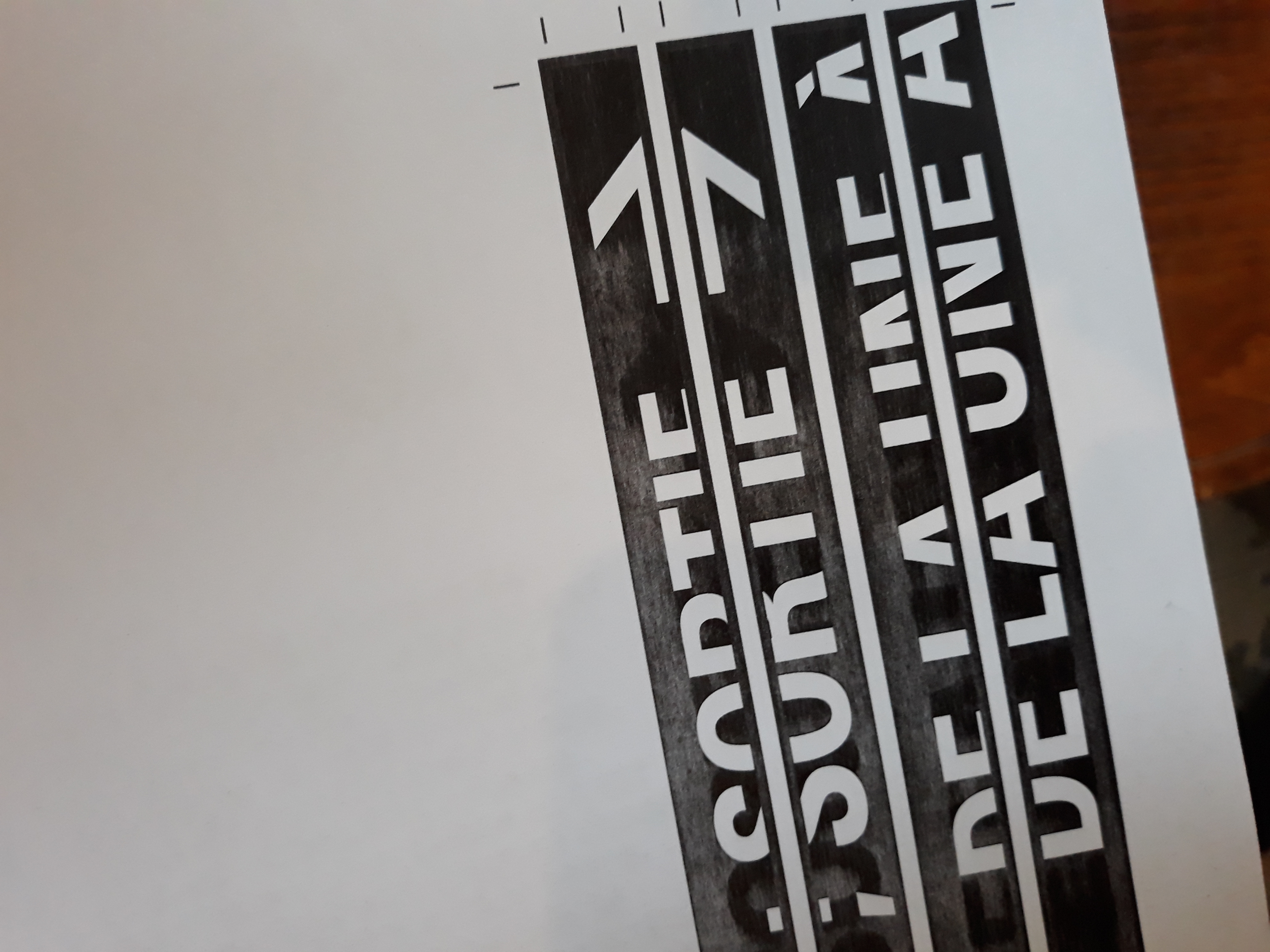
The proposition below plays with the idea of reading. Changes of direction punctuate a selection of new announcements made by Belgian train controllers:

Olivier Evrard, Aurore Lefèvre.
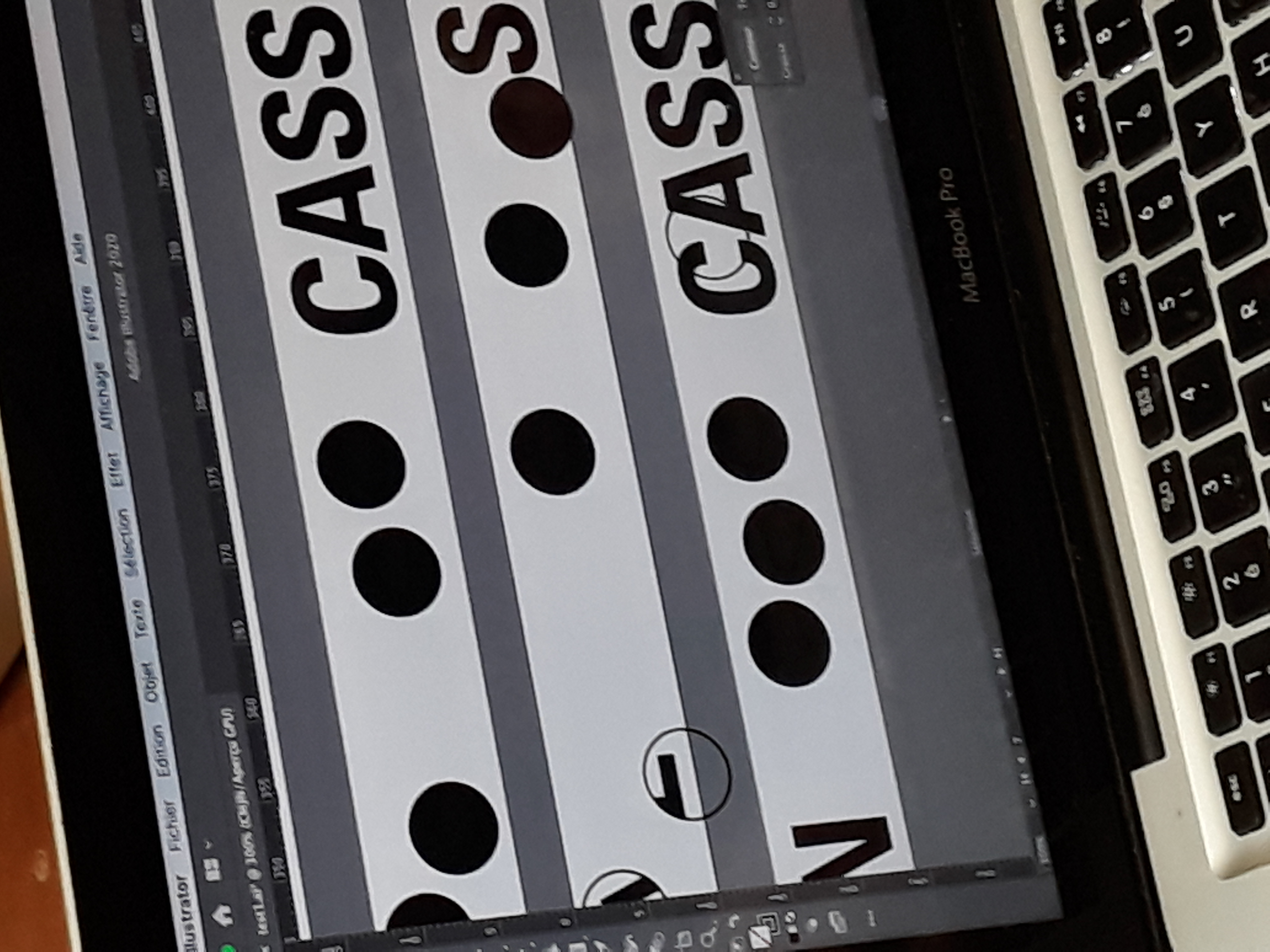
The following proposition draws attention to the specifics of letters by meeting up with three friends at the exit of a metro station:
Paul Bouigue, Hugo Chastan, Chloé Reboux.
The number that was chosen to be printed reverses the letters of the alphabet in a large body to make us move through its counterforms, alternating shadow and light, tunnels and station arrivals.
Thanks to all the participants: Valentine Auphan, Charles Berard, Paul Bouigue, Julien Braeckevelt, Hugo Chastan, Olivier Evrard, Michelle Grandjean, Lucie Henriot, Isabelle Huart, Aurore Lefèvre, Maëlan Le Meur, Christian Matriche, Paul Paris, Chloé Reboux, Marie Sion, Emma Sizun, Guillaume Slizewicz, Stéphane Stadler, Lise Walgenwitz, Eugénie Zuccarelli.
Available for purchase at radimpesko.com
Radim Peško’s work focuses on typography, type and editorial design as well as occasional exhibition and publishing projects. He has co-curated the 26th and 27th Brno Biennials, and he is visiting lecturer at Royal College of Art in London, ISIA Urbino, and the Master Type Design at ÉCAL Lausanne.
Links:
radimpesko.com • figliege.com